Showing posts with label Picture Included. Show all posts

Wednesday, 1 February 2012

..and I'm a material girl

Thanks to the recent material studies I've been partaking in, I've been able to create an amalgamation of the materials studied (with the added bonus of red plastic tubing) and flesh out one of the robots I created in the previous post!


There's also the added bonus of wood in this image, which I did the following study for:
Which has been my favorite study so far! Even through I used a different type of wood (closer to maple) for the robot legs.

Interesting note: The robot legs would actually work. The metallic balls at the top of each leg are magnetic and the larger magnets on the body of the robot can be triggered on/of and, when on, positive/negative so it creates a quick push-pull of the upper joints. These joints force the lower bend in the leg tense and lax and push the leg in and out.

Sunday, 29 January 2012

Rapid Prototyping and You

So, I learned this cool technique for rapid prototyping in concept art recently. It's pretty fundamental but hey, I've not used it before!

Basically, you create quick component pieces of what you want to create. Legs, arms, heads, basic body shapes, accessories, etc. It works well for cars, aliens, animals..anything really, but when I first heard the idea, robots seemed like the best fit for an initial try!

As such, I created the above, a selection of 'ROBOT PARTS', as I've so mysteriously named. It's a pretty safe set that didn't take me very long to mock up. The important things to remember here are:

a. We're focusing on the profile of the image

b. Shapes should fit together ~relatively~ well with little editing.

From here it was pretty easy to mock up some initial robot designs:


I've obviously added some small features to individual ones here, hanging wires, lights and the like, but overall almost all elements are available in the initial spec.

And I strongly believe that if I'd just tasked myself with creating 4 robots from scratch, I wouldn't of created anything so detailed with such funky outlines, and definitely not so quickly!

Saturday, 28 January 2012

Go on, touch it!

Would appear I was suffering for artist's block again recently. Usually I try to sketch it out, creating rough shapes and seeing what I can turn it into, or doing circle practice (drawing rough circles with my wrist, then elbow, and finally shoulder).

It felt like none of these were working for me, so, to avoid the mental block that creativity was imposing on me, I decided to partake in some material studies, and here are the results!


Leather


Steel
 Rock

The originals are, of course, on the left while my spherical interpretations are on the right. 
Both attempting to mimic a material while attempting to turn it into an unnatural shape was damn good practice, but still made me feel like I hadn't achieved enough.

So I made a house with a cool pool in Sketch-Up.


Rather happy with it, and while you can't see it from here, there's also a loft indoors with a ladder leading up and a bed.

Always entertaining to learn how to use a new piece of software!

Tuesday, 1 November 2011

Fabric Practice


Nothing  too spectacular for today I'm afraid, I just wanted to get some fabric practice done, and what better than a faux-fur hooded robe with gold seams, as worn my the summoners in League of Legends?

On the League of Legends note, I've now put quite a lot of time into Singed, Anivia, Teemo and Sivir, and have to say, I'm liking Teemo the most! Being able to out-Teemo other Teemo's is damnable fun, as well as littering Dominion with mushroom to slow the speed ups and negate the health points.

Hint for tomorrow: More fur of a different variety!

Thursday, 27 October 2011

Teal Waters

Feels like I havn't done a fantasy landscape in a while, so decided to churn out a mini fantasy scene.

I've been really enjoying drawing water recently, though am aware I need to work a bit more on the lighting and currents of it, particularly in a scene like this!

I'm pleased with the general shape of this piece, with the water-surrounded path leading to the sudden drop, however feel the perspective of the shot and lack of a height-comparable object, the sizes all feel a little odd. The stones making up the path are meant to be rather large, with the water on both sides of the path being close to a stream, however they feel as if they should be pebbles, making the trees feel miniature.

I really should of just used smaller stones in general to keep the sizes feeling correct, but hey, art's all a learning process!

Thursday, 20 October 2011

Another sketch dump!

I don't like the last one. :<

The first piece is the original, while the others are all manipulations using the Photoshop in-built tools to give different atmospheres. In particular, inside a volcano, under water, and ghoooost wooooorld.


A quick sprite of Akali from League of Legends based on the Pokemon sprites, went with a simple background but I think it all works well! The angles of the scythes are too (exactly) parallel though, resulting in a weird balance.

The year clock.
This would not work, so hard.

Tuesday, 18 October 2011

So long to the daily updates, onwards to a new era of art dumps!

As well as adding 3 more designs to my shop (UK: http://www.cafepress.co.uk/krillatron USA: http://www.cafepress.com/krillatron) I've been busy on my Cintiq!

Designs from the past few days:

Half an hour of animal speed sketches, there are so many horses on the site!


My first attempt at drawing a car (notice how the door couldn't open?), shortly followed by:

Less clean but more accurate!

Next, we get onto some T-Shirt designs:


A speedy piece of fan-art of Sivir (my current favorite champion over at League of Legends)

We're almost at the end now! Next up though is some Pink meets Pink Floyd~


And FINALLY, back to some realistic facial practice, this time with some emotion, as here we have Avril Lavigne crying:

And we're done! Still slowly making improvements with the work I know, on top of trying out some new things, I think everything's going pretty well!

Wednesday, 12 October 2011

Cafepress has 1 more store

http://www.cafepress.co.uk/krillatron

I finally got around to opening my Cafepress store today! There's only 3 designs available at the moment (the above being one of them) but I'm happy it's open at least, and should be easy to add additional designs in the future.

I generally aimed for cutesy fantasy designs with these, featuring 2 dragons and a griffon, all of which are mildly adorable~

I'll likely be adding quite a few more designs to the shop this week, so keep checking back! I won't post updates on here though unless I open a large new section~

Also, looks like I'll be drawing up a more solid contract with my volunteering work at the CAB tomorrow, so I'll have 2 definite week days put aside for art work!

Tuesday, 11 October 2011

The largest piece I've ever worked on

And here we have, today's piece:


A fantasy landscape that couples as being both the new wallpaper for my 2560x1440 resolution monitor, and a Christmas present for my grandparents!

I think the fading colours work well in this piece to emphasize the layers of the landscape, along with the mist along the floor of the mountains to raise the floating mountains.

I'm slightly worried about the saturation of the furthest bridge, however at the moment feel the solid triangular shape created by the linking bridges adds a lot to the image that the loss of colour to the latter bridge would take away.

Monday, 10 October 2011

Glut of images!

 I got a Cintiq 12ux yesterday, and as such here are the last few images I made on my sturdy old Bamboo! I can't guarantee all images posted from today onwards are 100% Cintiq work, however the majority should be, particularly as I'm finding it hard to tear myself away from my awesome new computer set up, all thanks to my lovely grandparents.

And finally, my first Cintiq play-around!

Sunday, 2 October 2011

Kim Ha Neul

Would appear I've gone back to trying out realism!

I'm still not quite trying hyper-realism (pores and all that up-close good stuff!) but I'll attempt it soon.

This is Kim Ha-Neul, an actress who, according to The Boy, looks like one of the characters in Lost. Having unfortunately missed that entire series, I can't be much of a judge of that, I'm afraid.

With this piece I chose to leave her hair, for the most part, blank. It made sense to show the general shape and structure of it, but I'm rather confident about my hair textures and, as it wasn't the point of this exercise, chose to give it a miss.

I think the skin tone came out rather well though, and I'm slowly learning what makes a face, well, a recognizable face. It's, I feel, a rather decent challenge for me as I've had trouble recognizing faces my whole life, to the point where it takes me about 2-3 times of meeting someone to even recognize that I've met them before, and far longer to put a name to a face.

A lot of it seems to be in the eye segment of the face. I say segment as I mean the entire horizontal region around the eyes, e.g. to cover up both below and above the eye area with paper. Personally, I get a much stronger idea of who a person is from this than from only viewing the nose or mouth segments.

For anyone interested, here was the image when it was halfway complete:
That's all for today!

Tuesday, 27 September 2011

Girls best friend?

I've always been interested in gems.

Particularly diamonds.

No, not in the 'pretty pretty shiny things, oh male being won't you buy me one?', more in the.. well, the physics of them.

There's a long history involved with diamond cutting, before the late middle ages, the natural octahedral shape of diamonds was the best you could get, and there was simply no way to improve upon it. Not due to it being a brilliant cut, far from it, but because diamond is the strongest naturally occurring substance of earth, and there was no way to shape it.

The first step in diamond cutting wasn't even cutting, per say. The jewelers would simply polish the gems to create even, flat faces. This first octahedral shape is now called the 'point cut' and isn't created for commercial use anymore, as it makes no use of the gems refractive index.

Refractive index is a term used to show how much light is refracted when it passes through a material, the more light refracted, the more light gets back to the eye and the 'shinier' the object appears. In order to make a diamond with good fire (dispersion of light), the angles had to be figured out!

The aim of the game in diamond cutting is try attempt to reflect ALL the light taken in back into the eye of the viewer. Lights hitting the gem through the entire 1080' of it's being must be attempted to be reflected back to the viewer, to make the gem appear brighter than apparently possible.

The first cut created to work towards this was the table cut, in which you take a standard point cut gem and saw the top off, creating a flat-top gem. The idea being the flat-top is on the top of the ring / bracelet and all internal light of the diamond is reflected back out of this facet. This idea holds true today and all commercial diamonds and gems will have the exit facet on top.

New cuts with more faces to the diamonds and gems were created over the years, spanning the single cut to the rose to the peruzzi. These pre-Tolkowsky cuts were created through trial and error originally, created for the 16th century idea of a symmetrical radiating pattern, allowing the light to travel within the gem and, for the most part, be reflected back till it all reached the exit facet.

This idea held true till around 1900 when the development of diamond saws and jewelry lathes enabled the more modern gem cuts to be born. Taken from Wikipedia:
Because every facet has the potential to change a light ray's plane of travel, every facet must be considered in any complete calculation of light paths. Just as a two-dimensional slice of a diamond provides incomplete information about the three-dimensional nature of light behavior inside a diamond, this two-dimensional slice also provides incomplete information about light behavior outside the diamond. A diamond's panorama is three-dimensional. Although diamonds are highly symmetrical, light can enter a diamond from many directions and many angles. This factor further highlights the need to reevaluate Tolkowsky's results, and to recalculate the effects of a diamond's proportions on its appearance aspects. ...
Another important point to consider is that Tolkowsky did not follow the path of a ray that was reflected more than twice in the diamond. However, we now know that a diamond's appearance is composed of many light paths that reflect considerably more than two times within that diamond. Once again, we can see that Tolkowsky's predictions are helpful in explaining optimal diamond performance, but they are incomplete by today's technological standards.
Not a definitive solution and the problem of creating the optimum proportions for losing no light still exists. In the 1970's a complete mathematical model was developed for gem design, which has since been the subject of computer modelling. As such, within our lifetimes we may discover the ideal cut of a diamond with higher purity of light retention than the round brilliant cut used today!

Friday, 23 September 2011

More Speed Drawing

The bane of the blogger in the following line:

My apologies for the slow update!


I've returned from Florida, and begun my search for employment!

I'm still volunteering at the Citizens Advice Bureau while I apply, and am at a pace of applying for around 5 companies a day at the moment. Thankfully, it turns out more companies than I thought are hiring at the moment, particularly concept artists / illustrators!

I'm also coming down with a bit of a cold though, swings and roundabouts I suppose.

Small holiday report: We went to Busch Gardens, Seaworld and Universal, The Boy took me for an amazing meal at The Latin Quarter at the Universal City Walk for my birthday, and my family (and The Boy, and The Sister's Roommate) all organized a surprise party for me with light-up balloons, LED straws and a VERY tasty cake!

Also, I'm particularly proud of The Best Friend at the moment as she's started her first year of university, studying Game Design!

Back to the art, this piece is around 3/4 of an hour of speed drawing practice, created, as per usual, with the help of http://www.pixelovely.com/gesture/figuredrawing.php, a tool I use frequently and can't recommend enough!

Friday, 16 September 2011

Singed : Witch Doctor Skin

Been playing around with this idea for days now, and I highly doubt this will be the last I post of it!

Basically, the idea began with changing the shield to be a tiki, witch-doctor mask, something I played around with but decided it took too much attention away for something that's always felt like more of a thrown-on item, with the large potion bottle always being the main focus. That in mind, I still loved the wooden feel of the tiki mask to developed it into something less attention-grabbing but still, in my opinion, pretty cool.

Next was trying to bring the theme through the image, so I decided the tribal patterns were the best way to do that. Continuing the pattern through on the shoulder pads and loincloth seemed to be enough to begin with, but I later felt only putting the bandage wrapping on one leg and tribal designs on the other helped the image flow more. Particularly when coupled with the spilled poison from the hand-held bottle.

Little features were added with the help of witch doctor references, like the shrunken skulls adorning the hair, feathers coming up from the neck and top of the chest covered with multiple necklaces rather than bandages (easier to see when coloured).

Finishing it off with a little throw back to another champion (the skull topping the bottle is based of Nunu's brother) and I feel quite happy with this skin design overall! I'm still not 100% happy with the legs/loincloth, and will likely be removing the ram's horns in the next prototype, but I'm liking how the whole idea is coming together. :)

Monday, 12 September 2011

Beware the Jibbon Swarm

The idea of a swarm of nom-happy creatures is hardly new, but it's always fun to work on your own version of a classic!

I've been thinking a lot more about the physics of creatures recently (a fairly strong physics and maths background always helps!) and I tried to portrait some of this with the 'hinge' mouth. The base of the mouth has very few, thin muscles capable of opening the mouth, while the upper 'teeth' actually work as a small series of electro-magnets with the power being drawn from the 'fan' tail. The teeth can be activated (forcing the mouth to close) by a pressure-plate-esque entity on the roof of the Jibbon's mouth.

This all works together to ensure the mouth generally hangs open while the creature is happily flying aorund, can be forced open if needs be, however if generally forced shut if the Jibbon's mouth becomes too full. This is necessary as, since the creature is so small, the mouth acts as both the entry to, and the main body of, the digestive system. Basically, the mouth is also the stomach.

Also, the basic composition of this piece is the basis of it's almost RPG element, 'You find a nearly ruined scrap of paper on the floor of the jungle, shortly followed by an increasingly loud buzzing sound..'

Saturday, 10 September 2011

Fox Hunting

I'm a bit of a fan of dragons taking the shape (partially) of other creatures, lion dragons, unicorn dragons and the like, and with such a similar skull structure I thought a dog-esque dragon would be a nice way to go.

Of course, a regular 'dog' would be very hard to pull off, how to you specify it's meant to be a dog? Furred dragons aren't uncommon, though while I suppose an incredibly mutt-like face, floppy ears or a dog's tail might well work, I decided to go the easily-noticeable route of the fox.

This creature does indeed split at the top of the spine, almost being 2 creatures sharing a single skull. It flies by spinning it's 2 tails in a propeller-like motion, using it's head 'fin' to keep the skull upright.

The idea here, of course, is the 'fox hunter', bearing the traditional (if broken) hunter's horn.

While cruel, it's deemed necessary to keep the creatures away from the Chincharrows!

Wednesday, 7 September 2011

I'm OLD


Created for this month's Dragon Challenge on DeviantArt, which I've linked every month so far so I'm sure you all know where to go for it!

This month was all about colour, so I chose the blue and purple stock to work from and used it as the basis of this piece.

Now, I was very fortunate in that, when I was creating the line art base of this piece, I had on hand some photographs I'd taken earlier in the bird sanctuary area of Gator Land! The parrots in particular had been throwing themselves into some very interesting poses (preening, outstretched wings, etc.) and one was doing a pose similar to this one, though it's head was looking out from under the wing.

Using the parrot photo as a pose idea, I set to work with the blue and purple in mind for the colour set of the dragon itself. Finding a way to incorporate the parrot feeling into a dragon piece was a great challenge, and I believe the wings were an obvious choice, as were the legs, however throwing in a feathered tail end helped bring the whole piece together.

The bright autumn leaves are something I've attempted before : http://fc07.deviantart.net/fs71/f/2011/131/a/0/one_of_50_faces_by_krillatron-d3g3mzq.png However I feel I was able to get them to look more realistic and interesting this time around.

Plus I'm rather proud of how the tree trunk itself looks! I'm always happy to see myself able to take on challenges and succeed where before it seemed insurmountable.

That's all for today! Wish me good luck in the contest!

Oh, and I'm now 22. :)

Tuesday, 6 September 2011

Long Post Is Long

Looks like yesterday was my first double day without posting!

Though I think I deserved a day off, mainly due to an 'event' that occurred yesterday evening.

As you may know, I'm on holiday in Florida at the moment, and we decided to have an outing to Apple-by's as we'd all heard about it but never been.

For the readers from the USA, I won't go too in-depth with an explanation or anything, but to the British readers back home: It's a MUCH better value-for-money Frankie & Bennie's.

Now, at Apple-by's, we didn't realize but they have a free double-up on pretty much any alcoholic drink. As we didn't think this was on EVERY drink when we ordered, we ended up with the equivalent of 8 alcoholic drinks between 6 people. (My dad and The Sister's housemate shared 2 beers and I 'doubled up' my mango mojito (not as good as the original) into 1 MASSIVE one).

You can probably see where this is going.

Basically, one MASSIVE jug-sized cup of mojito, half one of my sister's Daiquiri's and half a regular mojito later, I come home and realize I have around an hour before I want to head to bed.

I think, 30 mins playing League of Legends (3v3) and 30 mins for the blog post should be fine.

Only, well, we all get to level 18 on pretty even footing, with them having taken 3 of our turrets while we've taken 4 of theirs, and we reach a deadlock.

We own the lanes and grind the mobs, but due to their team being better balanced and refusing the push, we all just grind up items for AN HOUR.

Oh my WORD it was the SLOWEST GAME IN THE WORLD.

Especially in my inebriated state, I just wasn't in the mood. I was very close to just falling asleep on the sofa.

Eventually, they split to cover the lanes, I kill ones side and manage to get their final turret while they're fighting off the other side. They kill me before I get their Nexus down, but it's Gg from there~

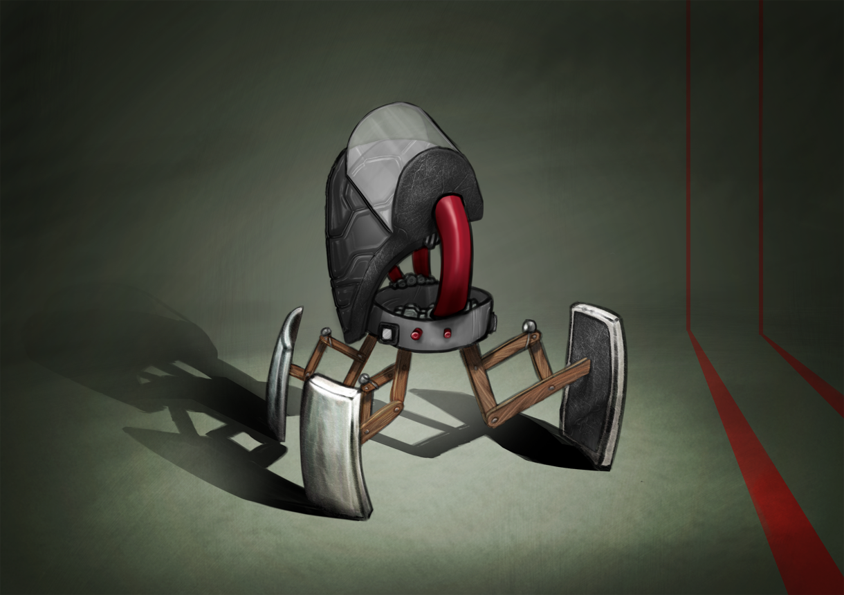
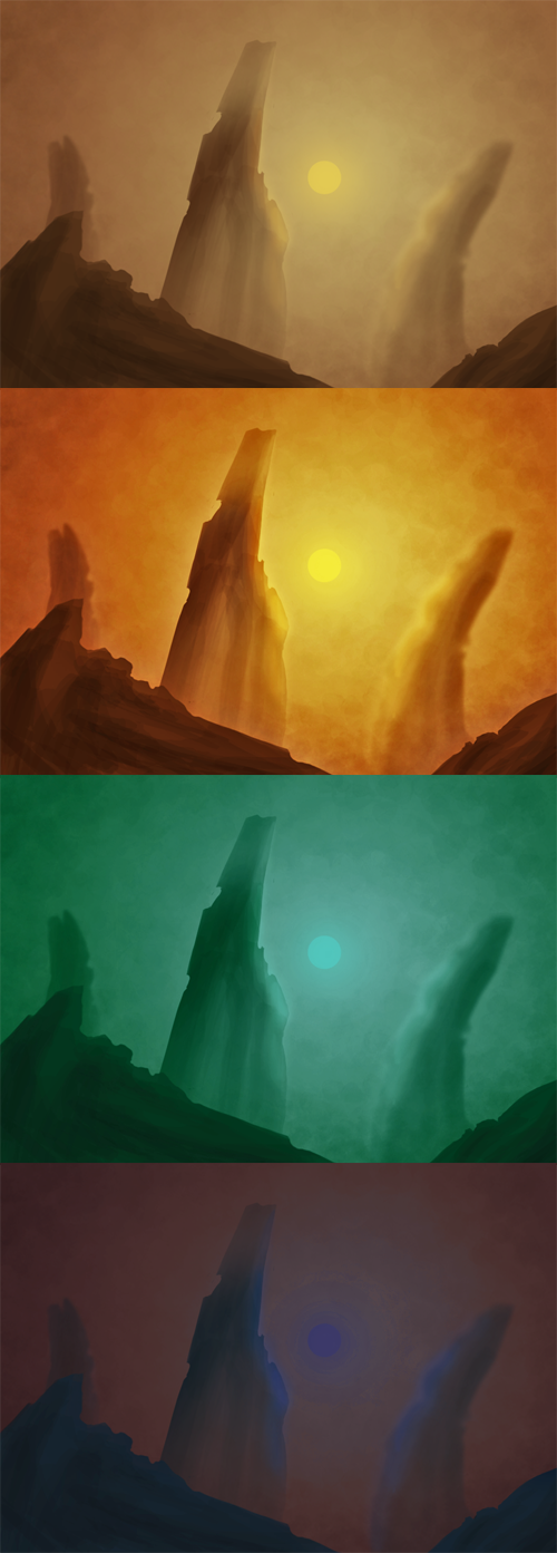
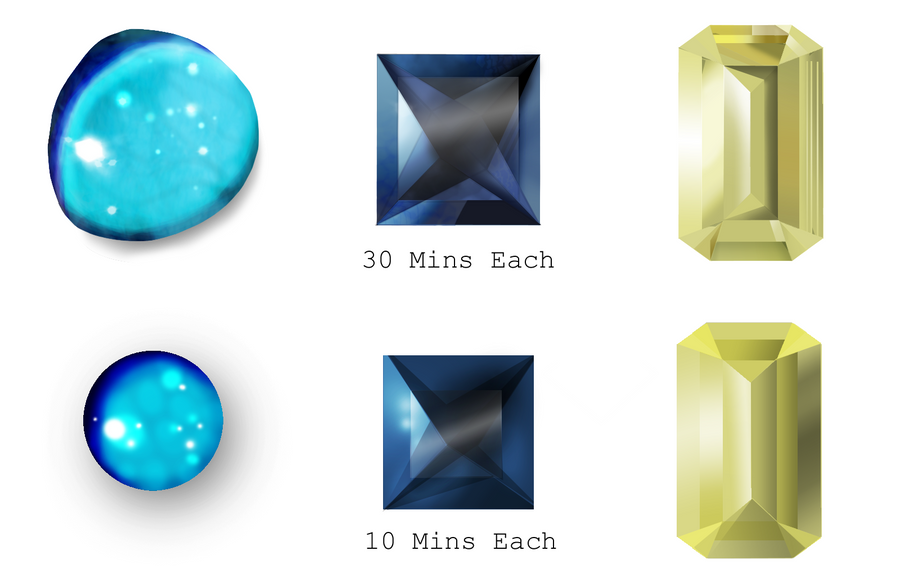
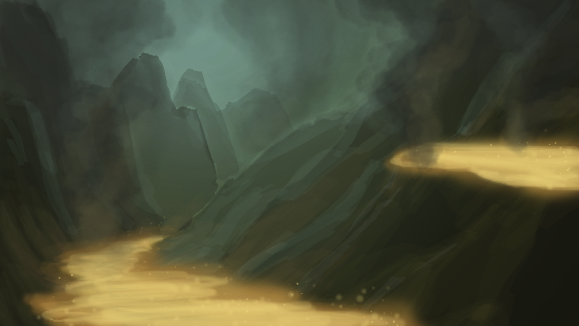
I'm sure you all found this epic yarn of my evening last night incredible, however back to the art:
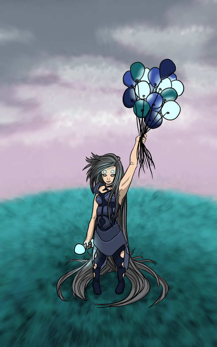
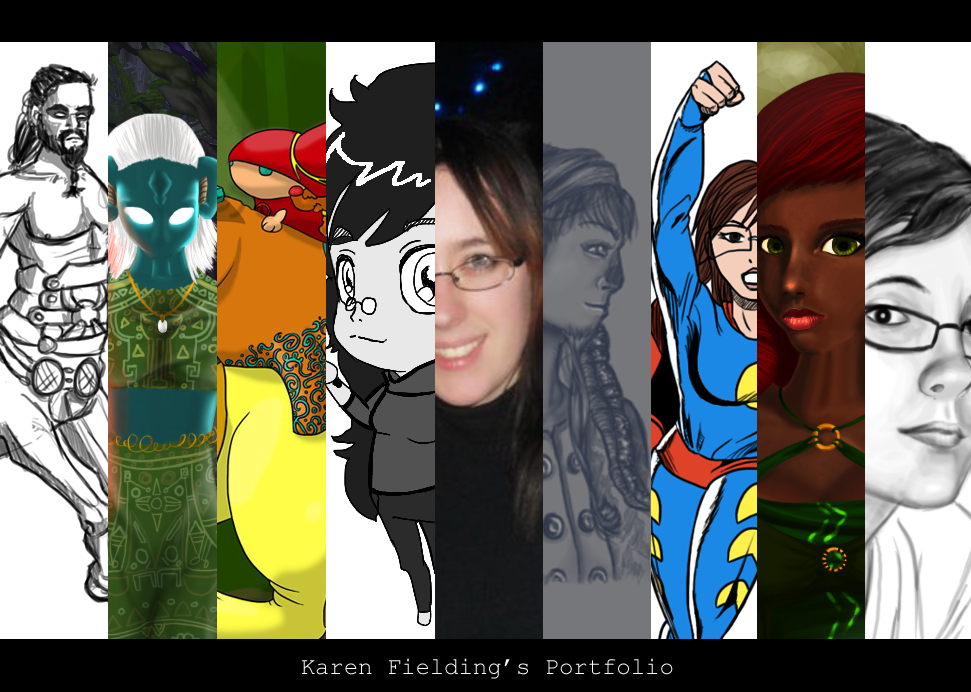
[art]

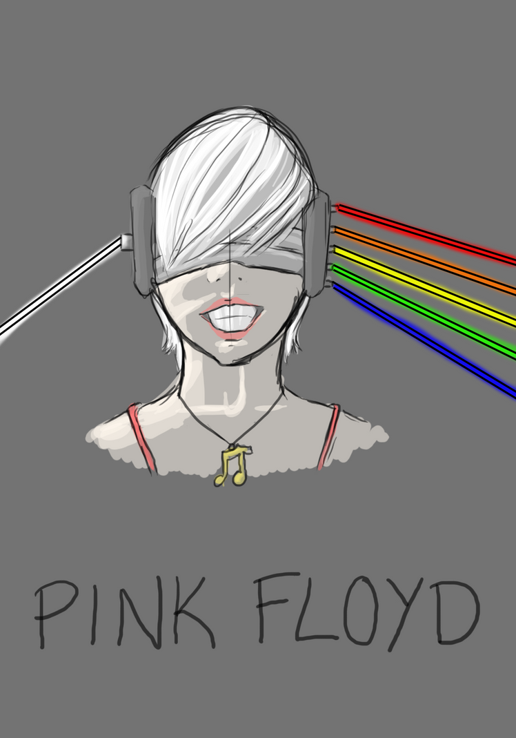
This is the new 'title' image of my portfolio.

[/art]

Saturday, 3 September 2011

Molten : Speed Paint

2 'molten' speed painted images based on the same concept, the initial being the smaller thumbnail image with the latter being the base of a future 1080p wallpaper.

I love finding nice palettes to work with! I'm such a fan of this one at the moment, but think I need to increase the yellow to orange contrast on the latter image a LOT before I release the final version.

I may also get rid of the upper lava pool on the latter image due to it rather stealing attention away from the focal point of the image, and making it hard for the eye to be lead around the scene.

It's also a struggle deciding between the overall feeling of the 2 pieces. The first image has a more lazy, rolling hills feel to the piece with the lack of contrast and the stronger light source drowning out some of the features. It's a nice, painted landscape that just so happens to have a lava stream running through it. This feels in start contrast to the much more malicious feel of the second image, with it's dimmer sky creating darker mountains. 

Also, for anyone wondering: I'm STILL working on the pixel brush pack. I've got to the additional items now and am slowly adding more and more pieces to it, however I may release it soon with what there is in it and then release updated versions later with user recommendations.

Thursday, 1 September 2011

Flow Rider


I'm in Florida! It's hot and humid and  I'll be updating MUCH less frequently, but still aiming for once every 2-3 days.

Animals are a LOT easier to draw than people...


I've completed a lot of figure drawing sessions recently,but these are the 2 sets while I feel are most presentable, with the first image showing some 30 second figure drawings and the latter showing 60 second animal drawings.

With only 30 seconds to capture a whole drawing, you really force yourself to learn what's important about a pose. Going in the classic Western style of top left to bottom right along the rows, you can probably see that, even in this 10 minute study, I made quite a bit of improvement. Most noticeable in the fact that some of the earlier pieces are grossly out of proportion or missing limbs all together...

I learned near the end that one of the best ways to ensure your figure has the right look and proportions is to draw the curve of the back, and if needed, line out the shoulders and hips.

Drawing directional lines on the face in the later images of the human figures also helped give a better sense of mood.

The animal drawings were another 10 minute study, though the order of these is more mixed up. Technically, it went Butterfly -> Colt -> Dog -> Bird -> Monkey -> Elephant -> Crab -> Horse -> Parrot -> Fish.

The parrot looks by far the best and that's 100% due to it being the most simple shape. 2 lines power over the entire piece and, after those 2 lines are drawn, the rest of the image was blocking in the detail, to the point where I had time to do the eyes and patterns, which are what I always leave till last.

Also, that IS a crab, not a spider. I'm afraid I'm terribly arachnophobic, and I was unlucky enough to encounter an image of a spider while doing this exercise. As such, I just skipped over it to the next piece which happened to be the crab, thank god!

I do most of my figure drawing from free, online sites these days. I still hope to go to more figure drawing classes in the future, but these are still a great way to practice from the comfort of your own home. And better yet, they're free!

Human Only: http://www.posemaniacs.com/thirtysecond

Creature or Human: http://www.pixelovely.com/gesture/animalanatomy.php
hostgator discount code