Sunday, 28 August 2011

Metablog


Not a particularly long or impressive post today, but here's the new signature work I'll be using to promote my blog whenever I'm scooting around forums. It seems to get the message across and, I believe, it's a fairly good representation of some of the art you'll see on my blog!

It's been such a slow day today. :< I'm going on holiday on Tuesday and have been looking forward to it for so long now, it feels like I should be there already, as such it's rather hard to get motivated to DO anything these days!

It feels as if the most productive thing I did today was get a new book for my Kindle...

That's all for today, tomorrow: FASHION or something vaguely resembling it!

Saturday, 27 August 2011

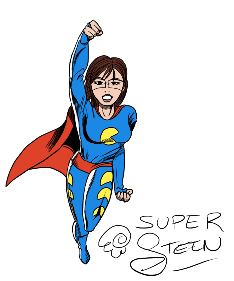
Super Steen


As you may know, I pride myself on being able to work in a wide variety of styles. I think it's a great way of proving I have a strong artistic basis is I can study and pick up any style in less than one day, usually on my first attempt, and I also believe it helps my employ-ability, as I will be able to adapt to a company's style as fast as possible.

As such, I found myself at an odds as I realized I hadn't even attempted one of my favorite styles. Bold and dynamic by design with some of the most interesting shading techniques I've ever seen, I'd never tried a traditional superhero comic style!

I decided to opt for the older DC style for this piece, as the newer work is too similar to work I've done before and a lot of their interesting shading has vanished. The posing is as strong as ever, but it's the style itself I wanted to try.

One of the things I had seen, but never really ~noticed@ before, was how the highlights are achieved. A flat, varying thickness white line is used to denote highlights, and to, well, to highlight these highlights, they're surrounded by black lines. This helps really show off the white lights while not being too obtrusive to the rest of the piece, and flows well in the image by being the same type of black shading used elsewhere on the image.

Of course, I made a few mistakes with this piece. The hair isn't in the right style, I couldn't find a good reference picture for glasses on a DC hero, and the cape seems detached from the shoulder at the left side.

Aah well :)

Friday, 26 August 2011

It's HUGE

Click for full size, warning though, it's... it's pretty massive.

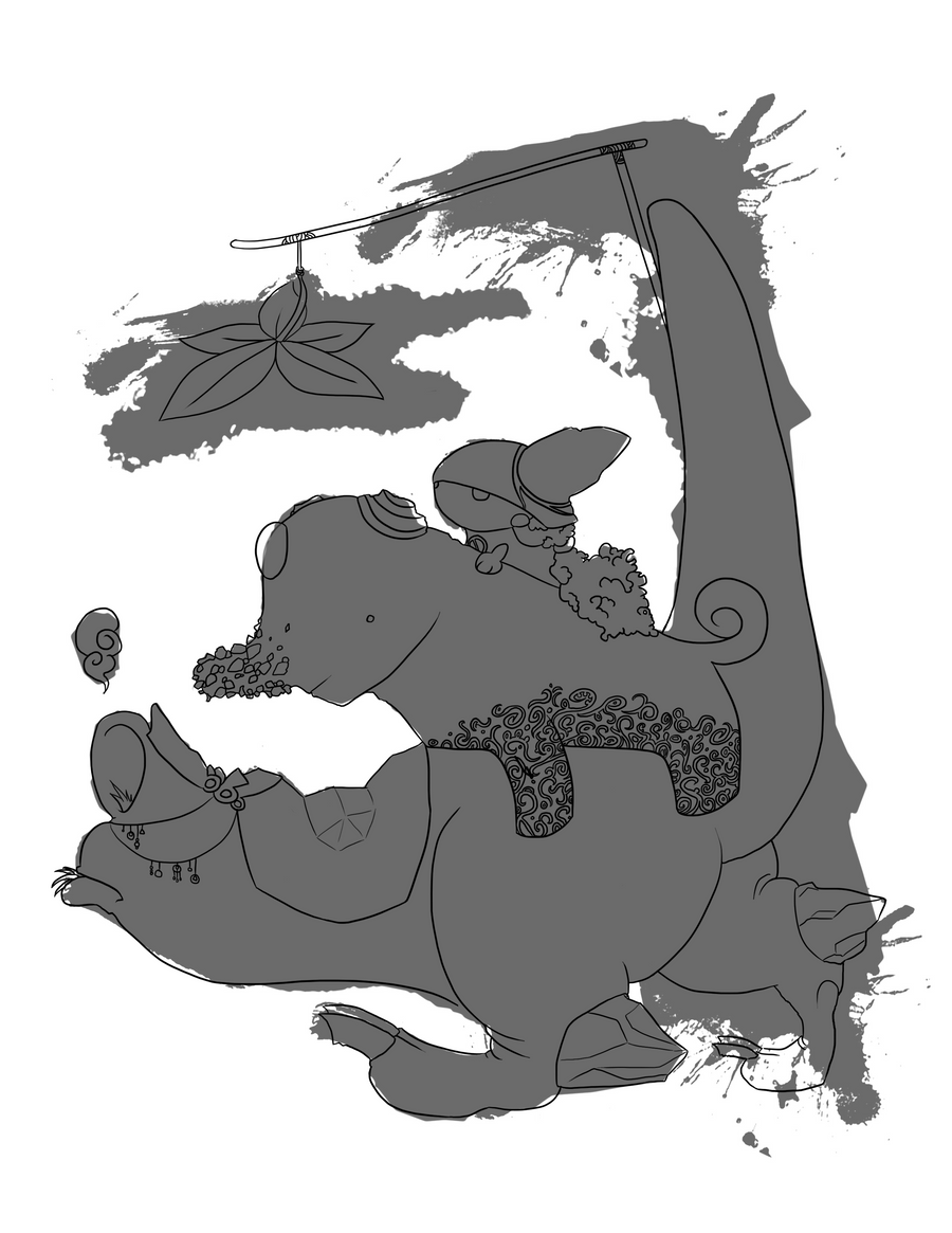
Right! This piece has a bit of a story behind it. The point of the creation of this art originates in a contest over at sketchaholics, a site I keep plugging to you lot.

Sketchaholics, as mentioned, is a great art based website which runs user-made competitions. Contests sometimes have prizes, though are usually run to give you ideas to combat artists block, improve other skills (draw 100 faces, draw 20 emotions, etc.), and to give everyone a little bit more exposure!

This particular competition was to create a piece based on an ink blot. You could rotate and resize the blob, but it had to be used as inspiration. Some people took liberties, and just incorporated the ink blot into a different piece (one case of it used as a cow's markings) but most people took the shapes and tried to make something out of them.

The original ink blot:


My interpretation, overlayed:
And I've got to say, it was HARD.

This has probably been one of the most trialing, awkward pieces I've ever had to do! First, interpreting the shape, I began with the little girl, though my initial idea was a bunny... Yeah. Then, the elephant just made sense with that short 'trunk' coming out, but I had to do something with all the bumps. With this, I decided to turn it into a jeweled, sequined toy elephant for the, now decided, girl!

The last shape was the worst, as initially I ignored the back leg which, of-course, made it look far too cartoon-y and silly (the 5-year-olds-profile interpretation of animals, where the forefront leg completely obscured the back leg). Adding the back leg was very awkward though, and left me a little out of the bounds of the ink blot.

The overall character ideas and creature concept are in styles I've never tried before and ended up looking like a child's book cover, which I'm surprisingly happy with!

Oh! And the COLOURS. My LORD colour theory bit me in the ass with this piece.

I originally wanted the girl to have orange hair, and green clothes. A purple elephant. And a yellow monster.

It clashes SO HARD.

Deciding on a gradiented effect has to be one of the better ideas on this piece, and I think it's subtle enough yet pulls the whole image together.

That's all for today!

Though, if anyone cares, the 'official' story of this piece: Not really based on Red Riding Hood in any way, here we have a girl who made her way into the middle of the hot jungle with her giant stuffed elephant. However, the heat got the better of them, and that's when a Golden Jungler (such an original name!) came to their rescue. Red Riding Hood even managed to attach a mini sun-blocking shade to the Jungler's tail for her sweet toy's health.

Thursday, 25 August 2011

It's getting late

And I'm afraid I'm still working on the piece I was hoping to post today :< It'll be up tomorrow! But for now, you get:

It's just SO DAMN GRUMPY!

Henyway, I (officially) had my last day of volunteering today! I'm still going in on the bank holiday Monday to sort out some extra work before my holiday on the Tuesday, but today was the last day I was in to see everyone and get the main bulk of work finished. Being (likely) the last time I would see my supervisor, I got her a cake to thank her for looking after me over the summer and generally making it all an enjoyable experience, and as an added bonus she's agreed to act as a future reference for me!

As such, all is well in the world at the moment, minus grumpy llama taking the place of any real art today...

Enjoy!

Wednesday, 24 August 2011

Dawww

Created for The Monthly Dragon Challenge on DeviantArt, one of the stocks this time around was a Lupin plant. As such, here we have a small, chubby yet VERY badly camouflaged dragon.

I really enjoy the colours in this one and particularly had fun creating the semi-transparent buds on the ears! They're meant to harden into horns as the dragon grows, same process as the claws and bud on the end of the tail~

I also did quite a lot of image enhancing with this piece. I try to stay away from messing with the hue/saturation/shading/contrast in the options menus too much as I like learning how to do it myself, however playing around with it on this piece on the background layer gave the interesting look to the flowers we see, which I'm rather happy with. :)

On that note, I'm reminded of when, in university, we had it hammered into us that we shouldn't have meaningless preferences and act fan-boyish to things. If you know VB and C, and feel you're not a 'real' programmer if you don't work in C for everything, then that incredibly-simple-to-program-windows-form is always going to take you far too long because you can't let go of your pride. Because of this, I'm happy to go out of the bounds of 'this doesn't feel like learning...' and just do the option that looks right. I learnt a lot in this piece regardless and I can't improve if I don't accept knowing what a better picture looks like, right?

Tuesday, 23 August 2011

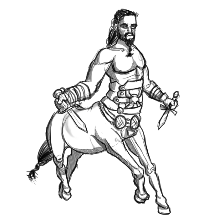
Drogo Reimagined?

I can't be the only one who thought this?

I've never read the books, so the series on Sky Atlantic was the first I'd seen of Game of Thrones.

Now, when Kahl Drogo is first talked about, he's referred to (in layman's terms!) the 'Ruler of the Horse People', or something along those lines.

Then, when he first meets to future Kahlissi and brother blondey-gold-face, we get the first sight of Drogo. The way it was filmed was to show a very dark shot of them in the distance, then the horses hooves, then Drogo's face. Seeing these aspects together made me go 'OMG CENTAUR YAY' in my head for a good 10 seconds until we finally saw the shot to prove he wasn't actually a part of the horse...lame.

Monday, 22 August 2011

In too deep

I play FAR too much League of Legends. Currently, I'm mainly playing as Singed while The Boy tends to play as Ashe. This lead onto a 'DAT ASHE' joke which became a mini comic far too late at night, which was later deleted due to it just being atrocious. However, this image survived and I'm rather happy with it!

I feel the proportions are cute without being chibi, the S-curve through the piece (predominantly through the head, chest and down her right leg, being where the weight is distributed) gives it a nice shape and I think the EXTREMELY simple shading nicely adds a bit of depth to the piece.

The background also turned out as I'd hoped, being an incredibly simple idea but giving a strong sense of there being a full structure there, and showing where the 'wall' stops and floor begins by simply ~not~ drawing anything has come off well!

That's all for today, join me tomorrow for some Game of Thrones art!
hostgator discount code