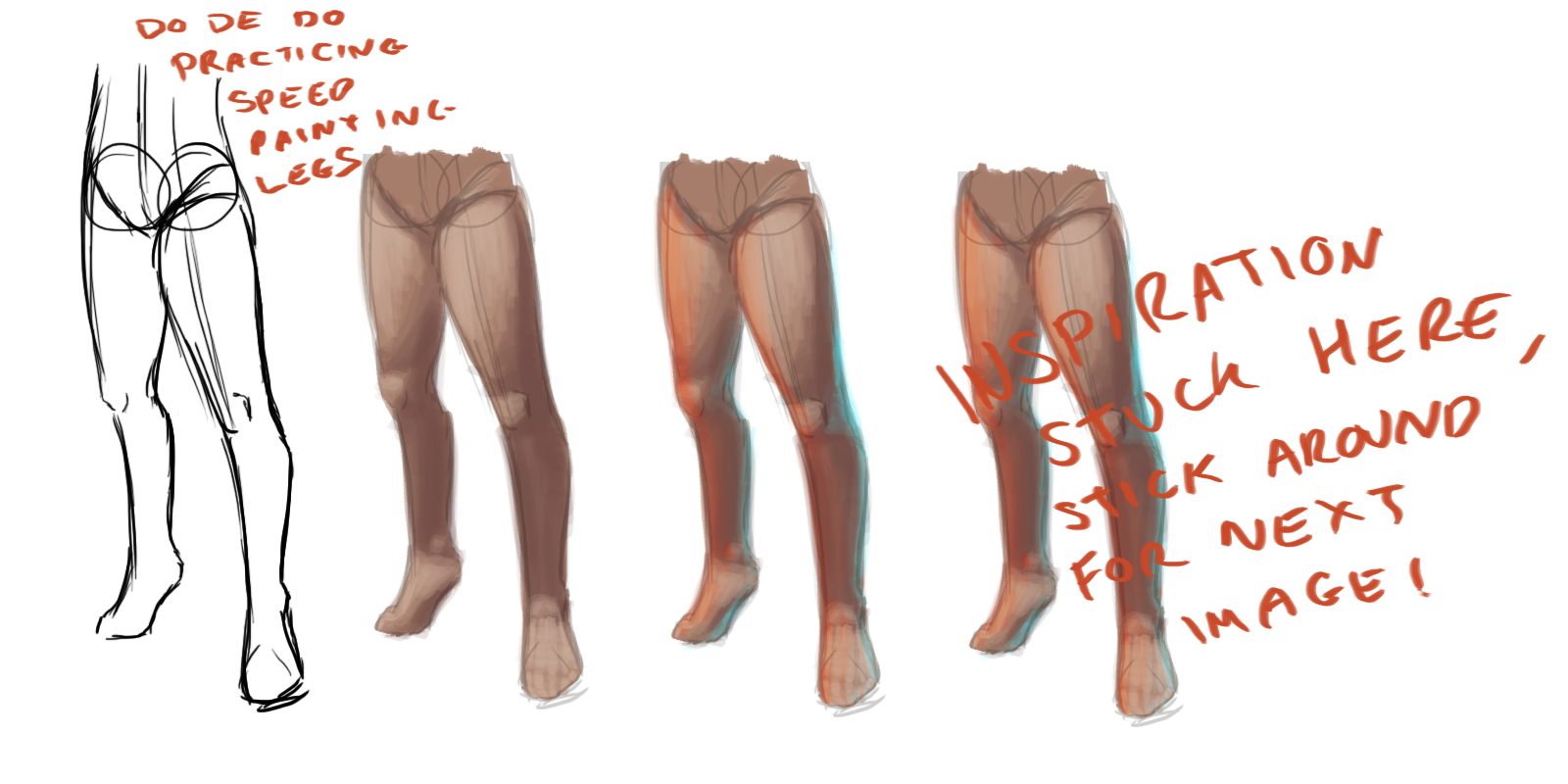
I've been drawing a lot of chibis and other block colour images recently and feel a little out of practice with other types of art, so I started sketching out some 1 inch poses and recreating them as rough full size versions, then I moves onto just drawing hands and legs:
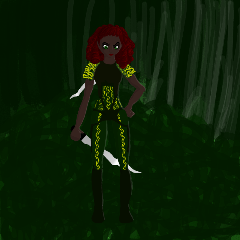
As you can see, inspiration struck as I started fleshing out some of the images! As such, there's an image in my gallery I've been wanting to recreate for a while...
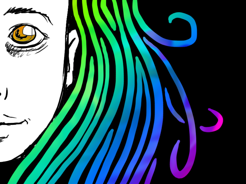
It was the first image I experimented with (extremely) curly hair, which then became a bit of a theme of mine for a while... Green! Purple! Copper!
As such, I began recreating this piece, with one of the first things I worked on being, you guessed it...
The lovely curls! I chose this particular bit to focus in on as it shows that I FINALLY found a way to end the curls! All of these the end curls are curling inwards, however some (one, the upper right one in the next image) curl out.
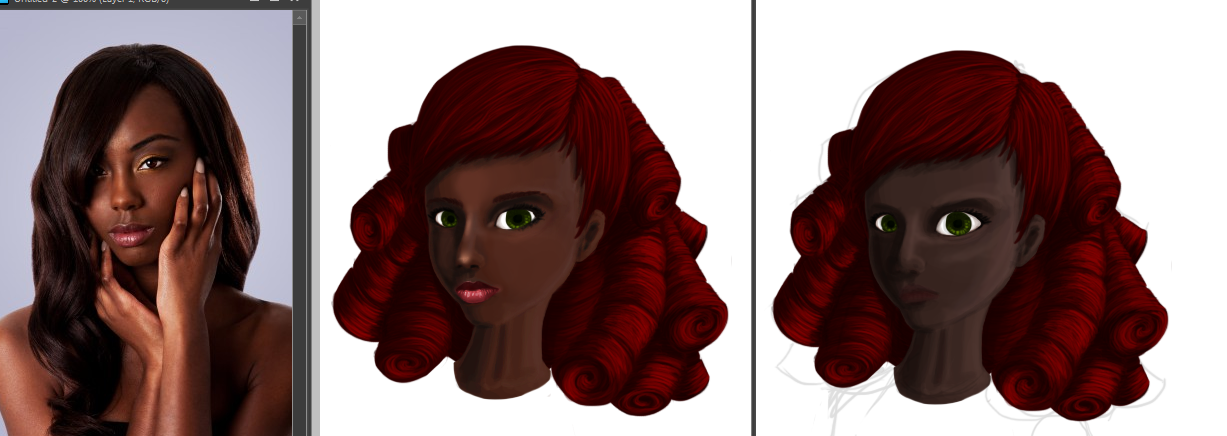
I also did all this from memory, so when I went back to the face I realised it looked a bit... bland and unrealistic. So I got a lovely reference image from [here] and the following occured!
The left is the reference, the right is the original, and the middle is the recreated face using the reference. As The Boy states, she finally looks more 'chocolate' than 'cocoa'. In general I softened the features, made the eyes smaller and less anime-esque, brightened the lips, changed the skin tone and reshaped the nose.
Thanks to anyone who read this all the way through!
Sunday, 31 July 2011
A series of fortunate events
Labels:
Guides,
Picture Included
Saturday, 30 July 2011
What a terraria catastrophe!
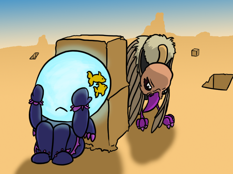
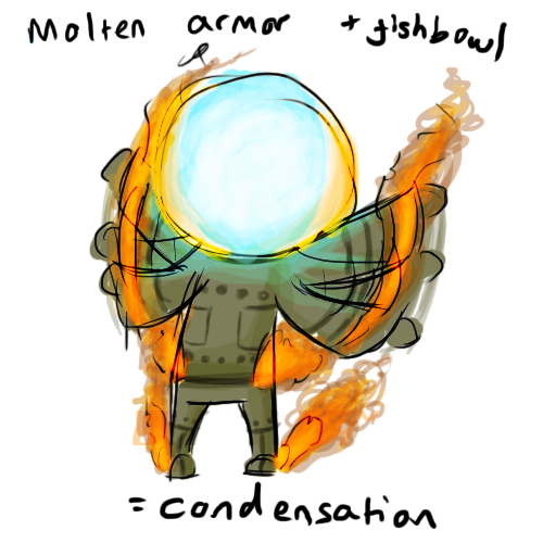
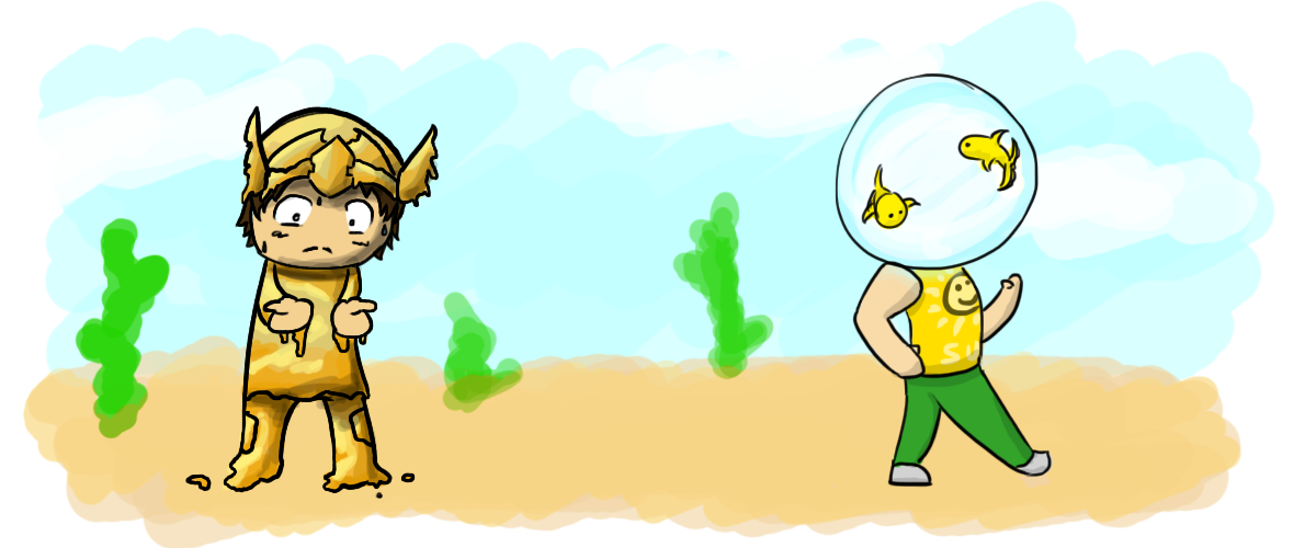
It's remarkably difficult to think of a fully 3D Terraria landscape without it looking like Minecraft (for obvious reasons) so I decided to go for a more...minimalistic approach with this piece. The character is tytasmaniantiger , a friend from DeviantArt, although their current armor is actually the same as one of my characters' current armors!
Will revisit this piece at some point as I forgot to cast the shadow of the sand blocks, meaning they almost appear to be floating :<.
I AM rather enjoying doing these fishbowl glowing effects though! And the mix between the evil eyed vulture and the curious goldfish made this piece particularly fun to draw.
Then we have more on the should-be-physics of Terraria!
Labels:
Picture Included
Friday, 29 July 2011
Blitzzzzz
Blitz Games Studios is an indie gaming company in England who produce pretty amazing games. If nothing else, the pure variety of games they produce is stunning, to the point of them needing multiple games divisions. Personally, I'm rather drawn to this company as I love the idea of such a huge variety of talent converging in one place, and who knows, perhaps one day I'll be a part of it?
As such, I've created a bit of fan art for some of their games :3 The top piece is for Dead to Rights - Retribution, a solid third-person action game with some pretty amazing concept art, go check it out for yourself! It's just so damn...powerful.
Then we have two games from Blitz's Arcade Game division. Clover, which has a lovely, almost Garfield-like feel to the character art, a puzzle-solving platformer, which was actually created by the smaller gaming company, Binary Tweed, who are associated to Blitz through their stellar 1up program, which helps to fund up-and-coming developers.
Last up is an elephant avatar for Encleverment Experiment, a great fast-paced multiplayer game which rewards noodles for your...noodle... for beating your friends at reflex and memory tasks.
The first 2 pieces are also "inspired" (liiiittle bit vain) by myself, with the latter, well, you can pretend it was also inspired by myself if you want to be mean, but really I just asked The Boy to name a few animals and see what he came up with that wasn't already in the game. :)
Labels:
Picture Included
Thursday, 28 July 2011
Le Boy
I get to see The Boy soon! It's The Best Friend on Saturday, then The Boy for most of next week! Then The Best Friend to go see Captain America next week, then The Sister to drop off a present for her new hamsters (of which mine is called Potato).
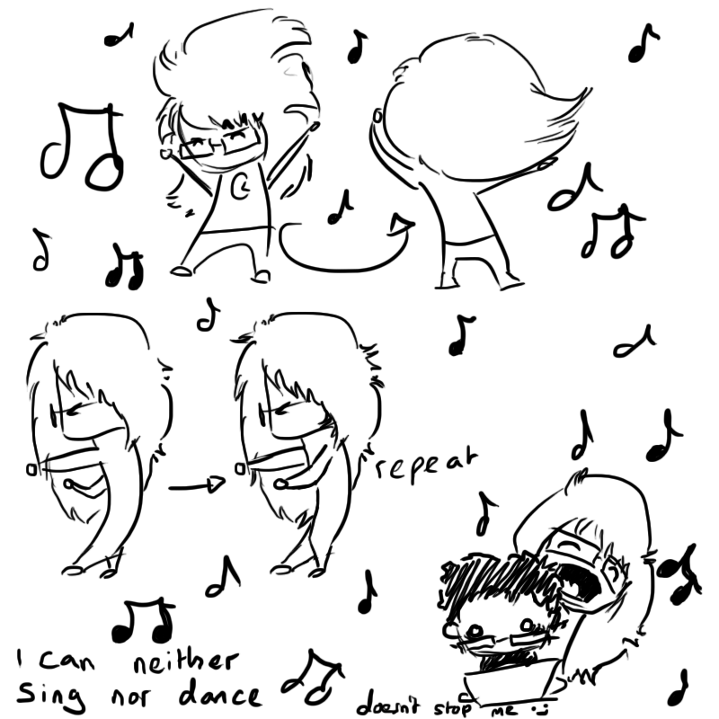
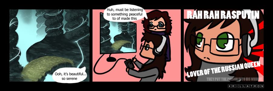
Anyway! I've been having a The Boy-centric day in my art today. In particular, I've been sat listening to a lot of good (imo) songs while singing along to myself, occasionally while over Skype, and am VERY aware that The Boy doesn't appreciate my innate musical abilities much (or lack thereof).
But I power on anyway.
Labels:
Picture Included
Wednesday, 27 July 2011
Fast as ass
Gradient (Circular) -> Select lower half -> Perspective to make wider -> Black line across middle -> Make it bumpy! -> Select lower half again -> Filter -> 'Ripple'
And that's how you do a 2 minute landscape.
NOW! Still fast, but some 'actual' art:
A quick little commission for a lass over at GaiaOnline. Unfortunately, I don't have anything to post today that took more than 15 minutes due to working for quite a few hours on a piece I won't be posting! I may post components of it but the full, finished piece will never appear on this blog I'm afraid. :<
Also, yesterday this blog reached 2,000 hits! I've more than doubled my reader base every month this blog has existed so far, but I'm particularly pleased with this news! Particularly as exceeded the amount of views my DeviantArt account has, which I've had for around 3 times the length.
Overall, thank you all for watching and I hope to be posting something a bit more entertaining tomorrow!
Labels:
Guides,
Picture Included
Tuesday, 26 July 2011
TerrariaWhereHasAllMyTimeGoneItWasHalfThreeNowItsEight
Terraria. Oh Terraria, what are you doing with my time you so forcibly steal? All I wanted was a way to unwind after a day out and now it's getting dark outside and
Labels:
Picture Included
Sunday, 24 July 2011
Now to think up some imaginative names
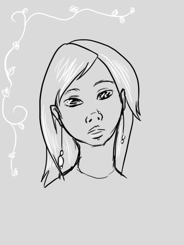
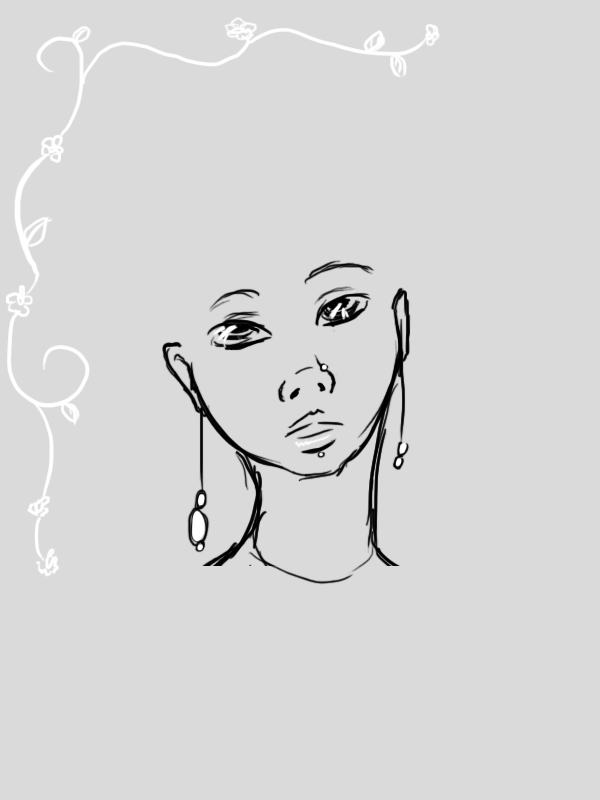
You might remember this image from a few days ago. Well, a few replies included that of a short, curly style and a longer, straighter style for the hair, so I decided to try them both out and see what worked best.
As such, we have:
As such, we have:
Personally, I much prefer the first style for this image. The fuller lips and earrings are left as key points in the image while the hair is kept short, while the darkness helps to emphasize the dark, expressive eyes.
The long, elegant neck is also nicely kept with the first hairstyle, and, overall, we see a beautiful young woman in her mid-twenties. A stark contrast to the blonde 16-year-old school girl we see in the second image, whose hair takes away from her earrings, meaning there is less of a link between the earrings/nose stud/lip piercing.
On a side note: Should be some weaponry designs among other things up tomorrow!
Labels:
Picture Included
Saturday, 23 July 2011
That's one hell of a walk through
Not only the longest walk through I've created so far, but probably the longest walk through I've ever seen...
It covers some (most) of the techniques I used in creating this piece, though in a while I won't be posting many more of these as I've decided to look into doing livestreams!
At the moment I'm thinking of just having the livestream open while I work, but I'm trialing how to have music playing to the audience while I work, etc. before I properly start and take requests while doing it.
Also, there's a look little almost-optical-illusion with this tutorial, in that if you scroll up and down pretty quickly, the far left line surrounding the text boxes appears to expand and retract as you go. This is due to the saturation of the colour with the 'brighter' teal seemingly creating a thicker line.
Labels:
Guides,
Picture Included
Thursday, 21 July 2011
Just got back from an important internation business meeting at McBurger
No walkthrough today I'm afraid, I got incredibly side-tracked with other very important international business meetings.
However, I managed to get this done, along with another character design for the group project I'm working on, so a rather successful art day!
I also created this while sketching out stuff, but can't decide on a hair style:
Going along with the Soothsayer image theme, I'm rather enjoying using just lighter and darker tones on a neutral background at the moment.
I also checked out Zero Punctuation's review of F3AR (FuhThreeUr) today, which I'm hoping beyond hope isn't as ghastly a single player as he's making it out to be, and noticed something a little odd..
She's been getting closer with every sequel!
If it's intentional (which I believe can be heavily presumed in this case) when it's a very interesting idea, if rather reminiscent of the Mr. Men books when, if you bought the entire collection, had a picture of one of the Mr. Men on the side. Either way, the slow approach of Alma till she's finally right infront of you seems a very fitting end for this incredible series, which has kept me on the edge of my seat (of stoic in the middle of the floor, depending on if I was playing it on my PC or PS3) for quite a few years now.
Labels:
Picture Included
Wednesday, 20 July 2011
Tronscape?
Walkthrough will be posted tomorrow!
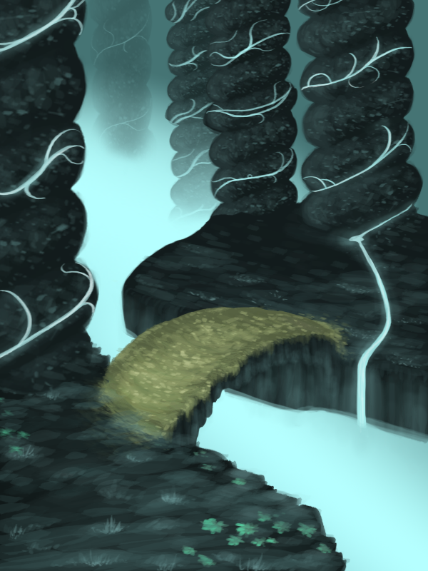
I'm very pleased with this picture, especially how fast I was able to get it done! It took a few hours but I was anticipating it taking closer to a whole day. I love the tranquil colouring and general feeling from this, and I really enjoyed working on it! I need to step away from landscapes and do some more characters at some point soon, but for now, I'm happy creating worlds!
Also, I didn't realise till after I'd finished, but the colour scheme is rather Tron-esque, and I'm rather enjoying the idea of a Tron bike racing over that bridge...But I digress.
I have to admit, this picture wouldn't look as good as it does without some help from The Boy, who said the same words to me that he says about every landscape (and many other) image I do, "more contrast". For once, I listened.
Labels:
Picture Included
Tuesday, 19 July 2011
I can't be the only one..
Who noticed this link?
It just... it works. They're both very top heavy, muscular males with wild hair and similar skeletal structures (read: stooped neck). Hell, the very idea of them, a large, furry creature first seen with fear but can speak and possesses a level of decorum viewed beyond his initial appearance.
On the note of the program, I got the card game further today by adding the ability to win items which actually function properly! At the moment, you can win a golden apple (stops hunger from occurring, presumable with the chewing-gum effect, your body believes it's receiving nutrients due to mastication occurring, though you're not actually swallowing much (any?) substance, and a golden brush which stops your pet from becoming dirty.
Tomorrow's task (after volunteering at the CAB and DIAL) is to get transparent PNG images working and to try to randomize the cards!
Labels:
Picture Included
Monday, 18 July 2011
My Mini Project part 2!
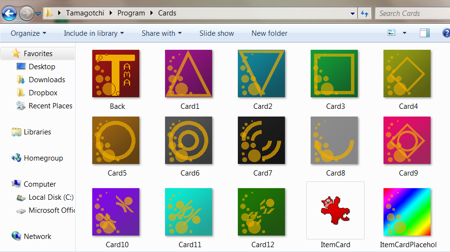
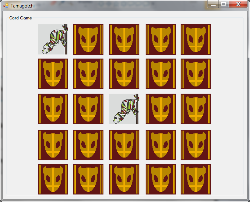
The card game is fully functional now! Well, minus actually winning the item, but the game part is playable! I'll still be adding a few things to it, like randomized positions for the cards and perhaps the timer will play a part in it, but for now the basic logic is there!
The lower right card if the 'item to be won' card, which will display an item (eventually!) that will be added to your inventory.
I was careful with the colour choices on these, I decided I definitely wanted to go for a strong red/gold contrast for the backs of the cards, which I think looks rather stunning when you begin the game, then I needed to ensure the cards themselves were different enough, both from the backs and from each other, that you can easily keep the differences in your memory. As such, similar shapes are on distinctly different colours to others (the teal and the purple cards highlight this) while most of the other shapes are easy to keep in mind when searching (circle, half circle, square, etc.).
On a side note, I've broken a toe! I was walking (dancing) out of the living room and bashed my foot on a footstool, hurting 4 toes and breaking one of them. I WOULD post a picture, but that would be simply too horrifying..
Labels:
Picture Included
Sunday, 17 July 2011
My Mini Project
Well I've been busy today! I set myself a 12 hour programming challenge which ended up being a 6 hour programming and animation challenge, but I still enjoyed it and am rather pleased with the results I've attained so far!
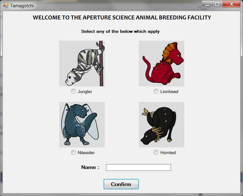
The initial page:
You may recognize these creatures, I was commissioned to create them a while ago but, since this isn't a commercial project, they'll be the graphics for this project till I expand out into genetic algorithms (that's right, this program will eventually have a breeding mechanism which means I need to create interchangeable body parts rather than pre-set creatures!).
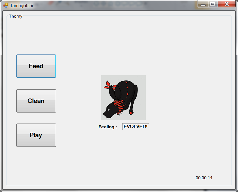
The main game screen at the moment:
Ignore the timer~ Here is where you look after your pet! The final idea is that your pet won't evolve while hungry or dirty, must be 'evolved' (See: Old) in order to breed, and you'll eventually have an item management system on this screen.
The 'Play' aspect related to a card game. Note: 25 cards. This is because the 1 final card is the item you can unlock during the game. To stop this being over-powered, you can't play the game while your pet is hungry or tired, and you have a maximum number of item slots. A lot of the items 'dropped' will be boring but necessary (special food or cleaning items to keep your pet in a 'normal' state for longer), others will be items that grant bonuses to your pet while they're in your inventory (either vanity (sparkles!) or for the game (hints), and then there'll be very rare 'items' of special pets.
You can have limitless pets but can't traditionally adopt any new pets till (all?) your current pets are evolved, and now I realise I'm doing a mix of rambling and giving away all the game :P So, the card game!
And, ofcourse, all the pets are animated:
The truly great thing about this project is that it's so...expandable. I want to keep the core game play simple so users don't feel they're missing out at the start because they don't understand something, but I feel I can really polish this off, continually working on the art, animation and, since it's my own project, I can manage my own level of feature creep!
Labels:
Picture Included
Saturday, 16 July 2011
Soothsayer
Based on: Soothsayer from Kung Fu Panda 2
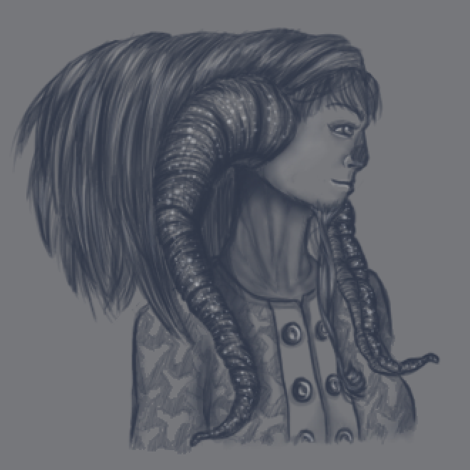
I've been working on this since last night, and I finally finished it this afternoon. Overall, I'm rather happy with the result! Originally I wanted to do a character design for an alien-looking humanoid creature with some reference to Pans Labyrinth: Original Piece
However after showing it to The Boy he mentioned some similarities to the Soothsayer from Kung Fu Panda 2, which we saw with The Best Friend and her boyfriend on Monday, and I rather agreed and decided to take the piece in a new direction.
I'm particularly happy with this image as I only used the hard-round brush and 2 colours on varying opacities and sizes.
I particularly enjoyed doing the sparkling horns, I decided the piece looked a bit too flat when originally doing it with just the darker blue colour so thought some strong white might liven it up a bit, and I now love the effect it created.
Labels:
Picture Included
Friday, 15 July 2011
Ahm Bloo
[Click for full size]
Been on a bit of a background-binge recently. Rather down to finding a palette I adore and not feeling like giving it up just yet...
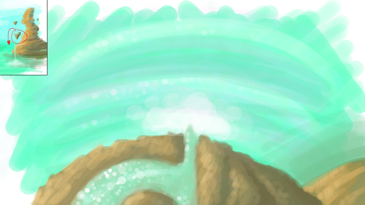
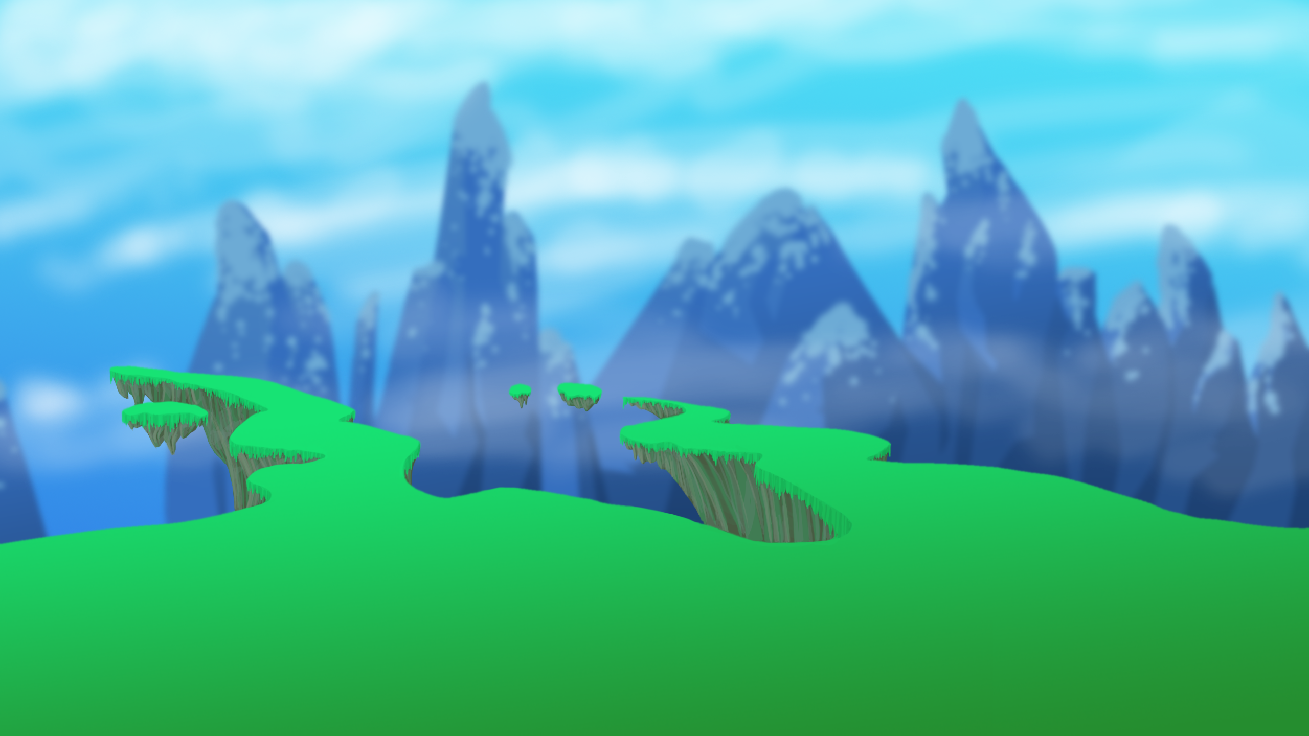
Anyway! If you've seen many of my previous scenery pieces, I'm rather fond of the idea of floating islands, particularly those with water cascading off them. It's a neat little idea (I think!) as it firmly sets a piece in a fantasy setting and allows me to play around with water effects.
As you can tell from these pieces, I've been trying out a new painted-style using a soft round brush on wide spacing with very low opacity (something I usually struggle with, but it's essential to keep the opacity low in order to keep your image from looking too flat) and long, sweeping strokes mixed with hard spots.
One of the main issues I've encountered with this set is in the second piece, imagining we're looking at this scene through a camera, both the foreground and far background are blurry, assuming a mid-range focal point. However...there just isn't one. There was nothing on the original piece I did to work with so I was left with a horrible unfinished feeling over the second piece. I'm rather tempted to re-do the second image, moving another of the floating islands closer to be within the shot so we can use that as our focal point, however it looks like I'm going to be very busy from now until next Wednesday so we'll have to see what happens!
Labels:
Guides,
Picture Included
Thursday, 14 July 2011
Holiday in 6 weeks
I'm going on holiday to Florida in 6 weeks! I'm off with my immediate family, The Boy and The Sister's Roommate. We'll be there for my birthday aswell, so should have some great times ahead!
However, this DOES schedule the beginning of the end, as the day I jet off on holiday will be the last day that this blog will be a daily art blog. I won't be able to keep up with it at all while I'm on holiday, I'm afraid, but while I WILL keep updating it after I return, I doubt it'll be as frequent as I'll be heading fully into trying to get into the world of concept art by then.
On that note, I'm trying to get everything I need to get done, well, done. As such, in the next few weeks you should be seeing a few more 3D pieces, quite a few more backgrounds and scenery pieces, a VERY widescreen wallpaper of Master Chief, perhaps a few more tattoo designs, and anything else I can think of! I still need to work on more weaponry designs, and a few more large, finished pieces.
I've been checking out a lot of online resources recently, and in particular want to share this site with you: http://www.ctrlpaint.com/store/. It's brilliant for beginners to digital painting, and has a good a reminder of the foundations for others.
On a side note, the interview went well today, and the graduation went very well yesterday, I DID end up tripping up however I managed to do it a good 15 minutes before the ceremony started, so a win there!
Labels:
Picture Included
Tuesday, 12 July 2011
Hey. Heeeey.
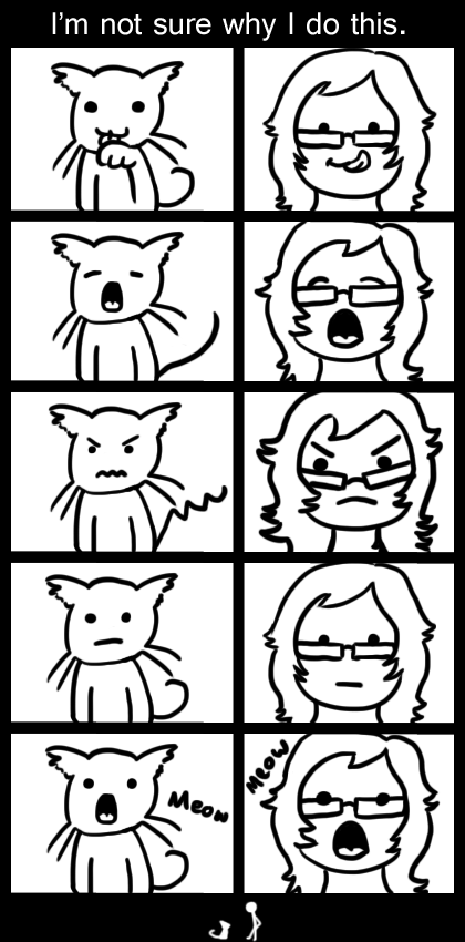
Decided to do a throw-away comic today, after realizing I speak more to my cats like this than in any other context.
Also, I'm afraid there won't be a piece up tomorrow as, well, I'm graduating! Looking forward to a day of sitting around, standing up, walking, smiling, walking again, then sitting for a bit longer!
Also, I'm afraid there won't be a piece up tomorrow as, well, I'm graduating! Looking forward to a day of sitting around, standing up, walking, smiling, walking again, then sitting for a bit longer!
Labels:
Picture Included
Monday, 11 July 2011
Chincharrow
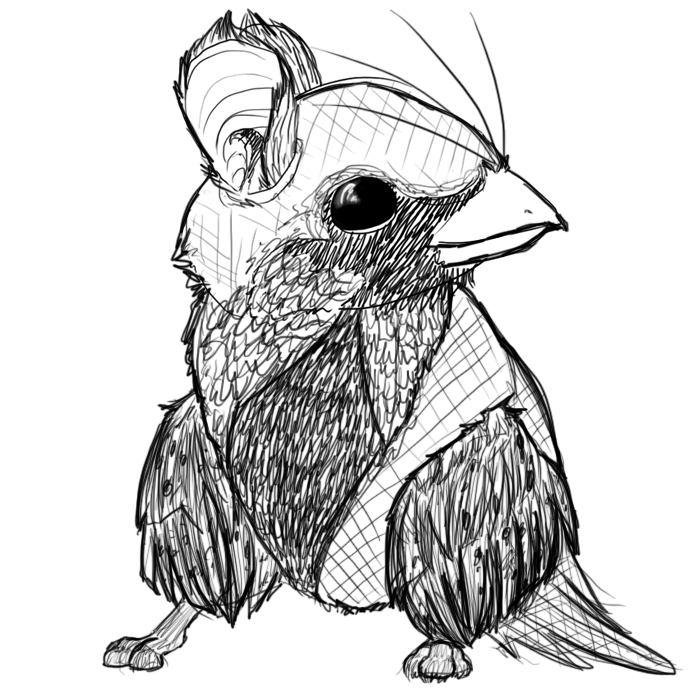
I loved drawing this! I've been wanting to do a monster mash-up for a while now, and this seemed like a cute idea.
I just keep thinking about it plodding around, chirping at things, with it's cute little wing-legs rustling....probably the closest thing I've drawn to a Pokemon in a while.
That's all for today! Wanted to keep it short and sweet after yesterday's mammoth of a post.
I just keep thinking about it plodding around, chirping at things, with it's cute little wing-legs rustling....probably the closest thing I've drawn to a Pokemon in a while.
That's all for today! Wanted to keep it short and sweet after yesterday's mammoth of a post.
Labels:
Picture Included
Sunday, 10 July 2011
A double ended chainsaw and other tools to avoid
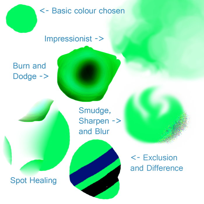
Good evening! I've realized I should explain some of the brushes I use and why I use them. However, I instead decided to show you brushes I never go anywhere near! Okay, depending on the piece I will occasionally use smudge, but other than that...
To begin with, I chose a nice off-green colour, the human eye naturally picks up green better than any other colour in the spectrum thanks to how much of our perceived gamut is taken up by green. (http://www.photo-lovers.org/img/gamut.png)
With this decided, to the brushes!
Impressionist can give an interesting watery look, however I find it far more interesting to see it in action than looking at the final result.. It works by taking the colour making up the majority of the brush radius at the time, filling the area of the brush with just that colour and blending the colours around it in with itself. Personally, I just can't find a style where this brush is suitable. It looks almost cartoonish, but I prefer a cleaner style for my cartoon pieces as blurring implies higher definition, making the eye look for details which just aren't there. To me, this brush creates a very dull "realistic" look that I can't wrap my head around.
Next we have burn and dodge. One lowers saturation, one increases shade (basically, one adds white, one adds black). It's an incredibly fast way to shade things, but...well, that's not how shading works. Light in itself usually has some sort of colour and it's this which should be used to light things. If you take any good picture of a lit human face from Google, use your eye dropper tool along where the shading begins to occur. Is it the skin colour, only darker? Usually not. You'll tend to find few dark peach colours and more blues and greens. Burn and dodge obviously don't take any of this into account, so I always stay well away.
Smudge, sharpen and Blur. Now, this is an awkward one, as I've recently taken to using smudge more... Sharpen and blur though! Sharpen, I've just never found a use for. Use it for even slightly too long and, instead of sharpening up edges and getting rid of blur, you get these horrible blocks of colour. Having tried sharpen a few times, I find other techniques much faster in tidying up blurred edges to this.
Blur...is fine if used sparingly. My main issue with blurring is that, if used over larger areas, it's very noticeable. You can usually tell when someone's been overdoing the blur, so I tend to try to avoid it all together if possible.
Spot Healing is a relatively new tool that I'm sure if great in photographs, but just..doesn't work very well for the kind of digital images I produce. You select an area with the brush, then let it do it's magic to get rid of the object you've selected and make it seem it was never there. Got an ugly bird in an otherwise beautiful sky? This is the tool for you. A misplaced toy on the floor of that photo of your daughter playing outside in the grass? Spot heal it away! Digital images? Yeeeeah...not so much. The issue here is the way it works is by sampling the area around the selected area and filling in the 'blank' with details and, if needed, blur anything left over in the area. Here we started with a green circle, and tried to remove the left of it. Instead of ending with half a circle, it sampled the area around 50 pixels to the right of where we selected and just copy-pasted it over the blurred out image of what we selected.... Not so great.
And the final part of this wall of text which I'm sure will get a few TL:DR's, exclusion and difference! Now, these arn't brushed in themselves, but types of the main brush. I just...don't see the point in them, what-so-ever. Exclusion is the slightly more interesting out of the 2, at least. Say you have an image you want to make black and white, but leave in the red? Go over the whole image a few times in pure green and pure blue brushes on exclusion and that's what you'll get. (Note: Here I was using a green brush over the green circle, hence leaving a black line). Difference left me with a blue line and...Well I just plain don't see the point in this one at all. Really, I'm not sure what you're meant to use it for or why anyone would use this. If someone knows, tell me? :)
Labels:
Guides,
Picture Included
Saturday, 9 July 2011
Grave Digger
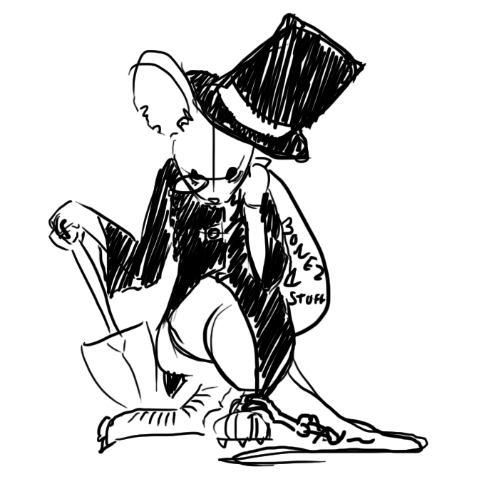
Well, I attempted drawing a Mousehunt mouse again! This time it was correlating the livestream being hosted by Jacon Johnson, the lead artist over at Hitgrab.
It was a pretty fun night actually, with everyone in chat contributing ideas to how the final mouse would turn out, only for it to then be implemented into the game later that night! Very fun times indeed.
The final design Jacob went with is more dramatic that this, with the mouse displaying shock over being grabbed, and holding a lantern providing a good lightsource for the scene.
All that said, I'm kinda happy how this sketch turned out. I like the proportions and how flat the feet and tail look on the floor.
That's all for today, tomorrow I might finally be tackling explaining some of the brushed in Photoshop, including why I use some of them and why I stay well again from others.
Labels:
Picture Included
Friday, 8 July 2011
Mobile Phone Wallpapers
On my Facebook page (http://www.facebook.com/pages/Krillatron/201179829933655?sk=wall) I've was asking people for their native resolutions to get a good idea what the majority of people use, mainly because I use a 1080p screen and so tend to design wallpapers for this resolution (I use a rotational wallpaper system and currently have 5 of my own pieces displaying on my laptop, kiiinda vain ><), however I've been wanting to branch out for a while and this seemed an idea way to do it.
As such, I was requested to create a mobile phone wallpaper, after a quick search for the native resolutions I was able to create this! I had a 15% opaque black box on a separate layer placed over this piece so I could see what the user could see (it's for a HTC phone where the wallpaper scrolls left and right slightly, so I generally kept the box central to see what the main image would be, as such when loaded onto a phone this image will show most of the tree though will be coming from the right-hand side of the screen, and must be panned to the right to reveal the rest of it's shape. I felt this slightly off-center nature would work well with the idea of panning across the image and 'discovering' more of it, as opposed to having a static image in the center and nothing on either side).
I used a technique I'm sure you're familiar with if you've been following my work, in that I did 2 gradient layers and erased one to reveal the other to get this effect. The detailing around the tree was on yet another layer, which I achieved by selecting the tree, expanding the selection by 3 pixels, making a new layer beneath the tree layer and putting a blue to red gradient over this aswel..
That's all for today! I'm getting ready for my graduation tomorrow (getting ready tomorrow, not graduating tomorrow, as my graduation's on Wednesday~) but will still post something up!
Labels:
Guides,
Picture Included
Thursday, 7 July 2011
Sometimes, just sometimes
Sometimes, it's nice to stare at things in the distance.
Extremely far away things like clouds are a tad boring, they have no detail.
Coming a bit closer, like the objects at the end of a road, are rather more pleasant as you can start to make out the definite shapes of trees and homes.
Perhaps 30 meters away? I can see all the individual leaves on a tree. I can't make out the finer details, but compared to the green blob that forms when I remove my glasses, it's surprising pleasant.
Now, 10 to 15 meters away is probably my favorite distance. I can see pretty much all the details of leaves, can follow the path of small insects flying around the bushes and plants, and I can see my cat clearly escaping out the house and across the road.
Around 1 to 2 meters away, it starts feeling...Well, it starts feeling like work. I can take in almost every minute detail of my Alienware backpack on the floor nearby, every piece of dust on the alien skull and see where the light is more heavily reflecting off the heavy duty fabric up to my eyes.
And then we get to 30 centimeters away, approximately the distance the monitor is away from my face. This is the distance my eyes are focusing at for around 90% of my waking day, sometimes more, rarely less.
Then I remove my glasses, and around 5 inches away from my face is the sweet spot. Where my vision begins to blur.
Labels:
Picture Included
Wednesday, 6 July 2011
Project Harmony
[Click for full view]
Was out an about all today I'm afraid, first with volunteering at my local Citizens Advice Bureau, followed by cooking tea (steak!), then The Best Friend came over, I ~attempted~ to dye her hair (aiming for a blonde streak, went light brown) then going to McDonalds (to spend a few hours drinking a hot chocolate!) then, well, getting home late and scrabbling around creating this!
It's created in a great little online project called Project Harmony, where you can easily kill a few hours playing with all the different pen types!
I used this to create something a little more formally for a competition a while ago:
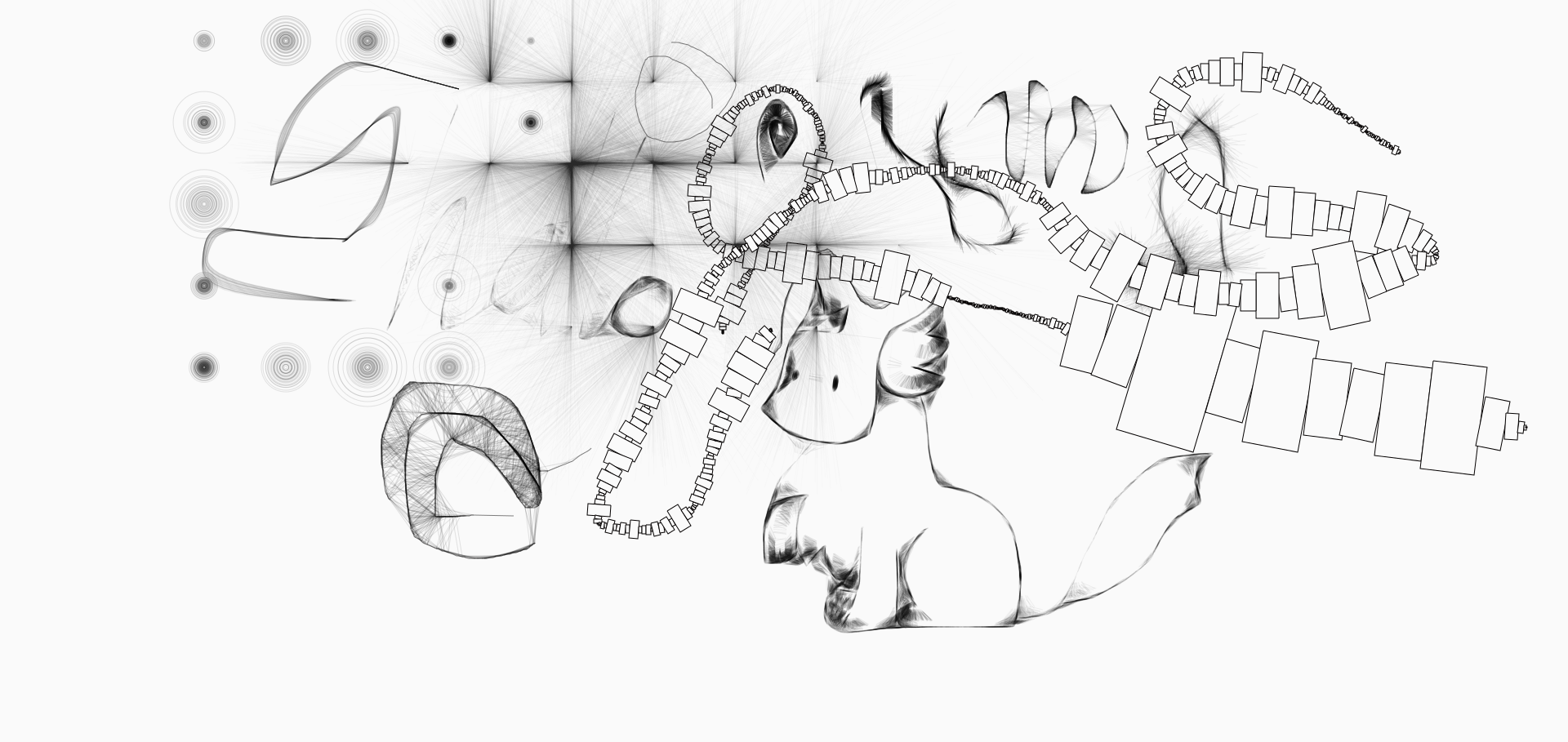
This piece actually came third in an online contest! It's certainly a lovely tool for making interesting looking pieces with a cute variety of pens.
Labels:
Picture Included
Tuesday, 5 July 2011
The first-person biography.
[Pre-Filter]
[Click for full size: 2560x1440]
[Post-Filter]
[Blarg version]
Well, it's a massive image today! Still not quite the finished state, but much closer than it was yesterday, and I rather enjoyed doing the overhanging grass.
As for the filtered version, weeeeell... I much prefer the original, I'll leave it at that!
As I mentioned yesterday, I'll be adding characters to it tomorrow, plus some..rocks? I think rocks. To force the perspective more. I rather wanted to add a funky tree, but I don't think it'd really fit with the style of the scene.
It also looks like I may just be getting a Cintiq and new monitor
Also, on a side note I'm graduating with a first-class degree next Wednesday! And went to an interview today which I'm pretty sure I aced, as I'm doing a follow-up-interview-slash-2-hour-on-the-job-trial sometime either late this week or next week. Everything's looking up!
Labels:
Picture Included
Monday, 4 July 2011
Seeing The Best Friend tonight!
As such, don't have as much time as I'd like for trying to steam ahead and finish this picture tonight, so it should be done by tomorrow instead! As such, I'll show you what I've got done so far instead!
It's a fantasy landscape which will eventually have a selection of characters on it~ I've been trying to get back into doing large images for a while now, and I think I've broken through the artists block on that front!
On a side note, I've been chatting to people in forums about keeping up with daily art blogs and challenges, and it's reassuring to be given support and know that other people are doing similar projects to this, and rather amazing to see the progress other people have made in the process!
That's all for today, I'm off to a BBQ followed by sitting in McDonalds for hours, only ordering coffee!
(I've reduced the size of this one, though I'm working on it at 2560x1440)
It's a fantasy landscape which will eventually have a selection of characters on it~ I've been trying to get back into doing large images for a while now, and I think I've broken through the artists block on that front!
On a side note, I've been chatting to people in forums about keeping up with daily art blogs and challenges, and it's reassuring to be given support and know that other people are doing similar projects to this, and rather amazing to see the progress other people have made in the process!
That's all for today, I'm off to a BBQ followed by sitting in McDonalds for hours, only ordering coffee!
Labels:
Picture Included
Sunday, 3 July 2011
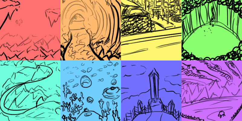
60 seconds
Restricted myself to 60 seconds per 'scene' here, which is damningly hard!
I went into this with some general ideas, blue = water or sky, green = forest, etc. but when you've been madly trying to cram all your ideas in as fast as you can it's hard to change your frame of mind so quickly to another type of scene.
To help get through the process, I began with just using the rule of thirds and later decided doing a general shape and sticking with it was the way to go. This is most noticeable on yellow through to dark blue, with a straight line -> circle -> 'S' curve -> circle -> triangle being most prominent on these.
The width and thickness of line were generally used here to denote depth, though sometimes used to exaggerate features within the image.
That's all for today! Though as an added extra, I've compiled my favorite dragons into a single image!
Labels:
Guides,
Picture Included
Saturday, 2 July 2011
A little bit of everything
Killer concubine's with killing nails.
Well, I wanted to do some clothing design, some "creature" design and work on outlines.
As I may of mentioned before, the outline of a character is incredibly important. There's a large amount of biological reasoning behind this, which I won't go into here but generally comes down to humans (and animals!) percieving certain shapes and movements as a threat, with the essence of the threat being based on the, well, shape and movement.
Personally, I'm terrified of spiders. Their little spawns of satan who scare me more than anything else I've met so far on this planet. I literally cry and leave the room. And it's part of this which inspired me! Oddly enough~
You see, I've always been of the firm belief that the reason spiders scare me so much is that their legs reach me before their body does. Sounds...odd and a little mental, I know, but it's true. It doesn't help that I don't see the leg as an extension of the being, to me that leg is a weapon to touch me and make me cry. And no matter what I do to the leg, it won't hurt the main threat, the spider itself. Nonsense, but that's the feeling. I have a similar reasoning as to why I find people with swords scarier than people with badass kung-fu skills. At least when people come at me, arms flailing, I know if I was covered in spikes (this is actually how my mind works) I'd be fine. A sword/halberd/morning star/etc? Jokes on me.
So! I took this idea and extended it into killer-sharp nails on a concubine, adding the layer of fear in that a concubine is a woman who you will usually be alone and intimate with. Much like the FEAR franchise, along with Alice: Madness Returns, Naughty Bear and many others, we're taking the idea of something deemed safe and making it threatening. Another reason why the outline is so important in this piece.
To sum up? First glance: Lovely lady in a pretty dress, with flashing eyes and an 'interesting' headpiece. But then you wonder about the nails-on-a-chalkboard sound you can hear. As soon as you notice her fingernails dragging across the floor the image takes on a whole new shape, one by which you need to get close to the opponent in order to attack it that, while somehow staying out of reach of the "claws".
Very much a Dante's Inferno encounter, as opposed to Warcraft. A lot of the fear is taken away when you stand in the hitbox and hammer 2, as per usual.
Labels:
Picture Included
Friday, 1 July 2011
Just a quickie
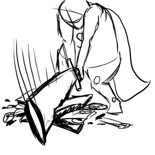
I won't be around my tablet nor laptop this evening so, to ensure I get SOMETHING posted today, have quickly mocked this up before I go out.
Asking The Boy what I should draw today, he replied in his effervescent wisdom ' a dude wielding a massive sword to cut his sandwich in half'. This rather sums up where I think I've been going wrong with my images recently: Nothing HAPPENS in them, they're static pieces showing a use of a particular style without ever telling a story. I think I need to start drawing more action, dynamic images if I want to continue improving, and this seems like a good place to start!
As such, here I tried to play with weight, perspective (heavy lines implying objects closer to the viewer), pose and other such buzz words!
(And yes, this image is portraying a now elderly, let-himself-go Superman)
Labels:
Picture Included
Subscribe to:
Posts (Atom)
