Tuesday, 30 August 2011
End of an era
For another contest over at http://www.sketchoholic.com/contests.php , if you're interested in improving your artwork and love the idea of winning prizes or, at least, getting some more people to view your work, this is a brilliant website! The multitude of contests also really helps break through artists block.
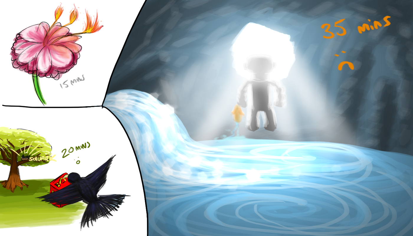
The subject of this contest was to draw 3 images in 105 minutes, 15 minutes on an image of a flower, 30 minutes on an image of a lazy bird, and 1 hour on an image of a robot with an unusual friend.
While I'm happy with the idea of the flower I produced, the second image annoys me a little as I'm pleased with how the bird, tree, background, box, etc. all came out but the image itself is very dull. :<
The third image...was a fail. I learned about some Photoshop lighting effects I may use again in the future but shouldn't of used here, the 'friendship' seems bland, if deemed to exist at all, and there's no real reason the robot should be in the cave in the first place...
Though I HAVE found the practicalities of images is stopping me from creating some fantasy pieces. I tend to shy away from the type of work Genzoman does at the moment, as while he produces powerful, wonderful images of strong characters in a battle stance, there's never an enemy. There's never a reason WHY the person is summoning a fireball while shouting into the air. I find it very hard to draw things I can't reason, and I can't help but think my logical programming background may be holding me back a little here.
Heh, I guess I should just go do it! Jump over the hurdle and see what's on the other side...
Also, I'm afraid to say that this is the beginning of the end!
I go on holiday tomorrow and I'll be trying to update this blog once every 2-3 days while on holiday.
However, immediately after the holiday I'll be applying for concept artist jobs. Having seen many new positions opening up, I'm keeping my hopes high! And, of course, once I get a concept art job, the reason I was keeping this blog will be over.
Who knows, I may re-name it to 'Broke into the industry my own way' and keep posting, but we'll have to see!
Labels:
Picture Included
Monday, 29 August 2011
Cool shading bro.
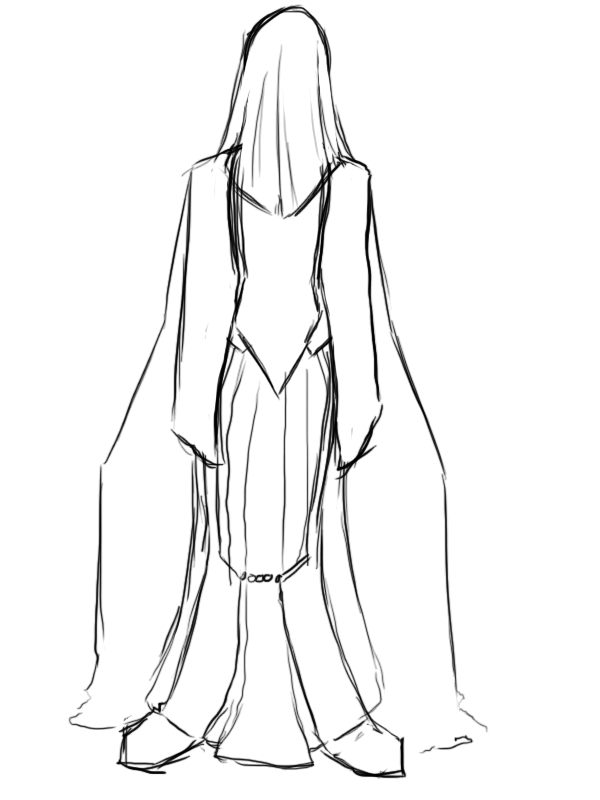
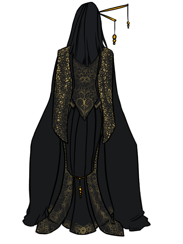
Here's a design that's actually been playing around in my head for a little while now. I've always been a fan of intricate designs like this and thought it'd be interesting to have them as part of a fantasy, almost Japanese style dress.
The main thing I wanted to keep in mind was the shape being portrayed, I wanted to capture the feeling of curves and an hourglass figure while not being over sexualized and, of course, keeping everything covered. This is most obvious in the 'tails', the twin pieces of patterned fabric which are attached at the top at the sides of her hips, was are pulled inwards at the back by gold beads to create a soft curve.
It's also prominent in the shape of the waistcoat (not technically a waistcoat as it's a single bodice at the front (not shown) but that's the best way of describing the cut at the back).
Overall, it's a VERY simple image with no real shading but I love the illusion of depth, shadow and of the material I'm using in the very easy 'shading' I did on the patterned parts of the coat.
I've also realized I'm not too keen on the hairpieces. I love the idea of them, particularly in that they match the beading lower down the dress, however I tried to get a 3D effect by having one of the pieces coming out towards the viewer, but with no other real sense of depth in the piece is just goes to make the rest of the image look flatter.
At least I learned!
Labels:
Picture Included
Sunday, 28 August 2011
Metablog
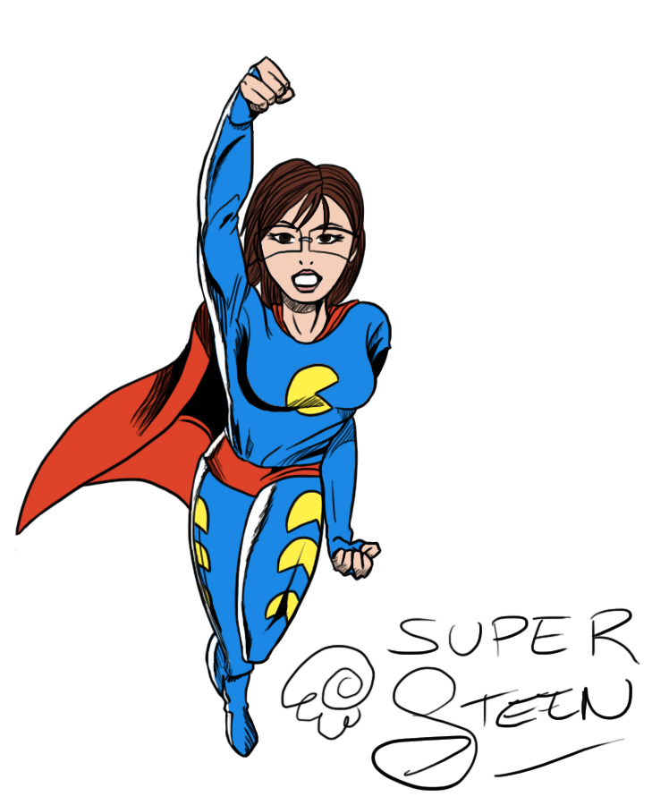
Not a particularly long or impressive post today, but here's the new signature work I'll be using to promote my blog whenever I'm scooting around forums. It seems to get the message across and, I believe, it's a fairly good representation of some of the art you'll see on my blog!
It's been such a slow day today. :< I'm going on holiday on Tuesday and have been looking forward to it for so long now, it feels like I should be there already, as such it's rather hard to get motivated to DO anything these days!
It feels as if the most productive thing I did today was get a new book for my Kindle...
That's all for today, tomorrow: FASHION or something vaguely resembling it!
Labels:
Picture Included
Saturday, 27 August 2011
Super Steen
As you may know, I pride myself on being able to work in a wide variety of styles. I think it's a great way of proving I have a strong artistic basis is I can study and pick up any style in less than one day, usually on my first attempt, and I also believe it helps my employ-ability, as I will be able to adapt to a company's style as fast as possible.
As such, I found myself at an odds as I realized I hadn't even attempted one of my favorite styles. Bold and dynamic by design with some of the most interesting shading techniques I've ever seen, I'd never tried a traditional superhero comic style!
I decided to opt for the older DC style for this piece, as the newer work is too similar to work I've done before and a lot of their interesting shading has vanished. The posing is as strong as ever, but it's the style itself I wanted to try.
One of the things I had seen, but never really ~noticed@ before, was how the highlights are achieved. A flat, varying thickness white line is used to denote highlights, and to, well, to highlight these highlights, they're surrounded by black lines. This helps really show off the white lights while not being too obtrusive to the rest of the piece, and flows well in the image by being the same type of black shading used elsewhere on the image.
Of course, I made a few mistakes with this piece. The hair isn't in the right style, I couldn't find a good reference picture for glasses on a DC hero, and the cape seems detached from the shoulder at the left side.
Aah well :)
Labels:
Picture Included
Friday, 26 August 2011
It's HUGE
Click for full size, warning though, it's... it's pretty massive.
Right! This piece has a bit of a story behind it. The point of the creation of this art originates in a contest over at sketchaholics, a site I keep plugging to you lot.
Sketchaholics, as mentioned, is a great art based website which runs user-made competitions. Contests sometimes have prizes, though are usually run to give you ideas to combat artists block, improve other skills (draw 100 faces, draw 20 emotions, etc.), and to give everyone a little bit more exposure!
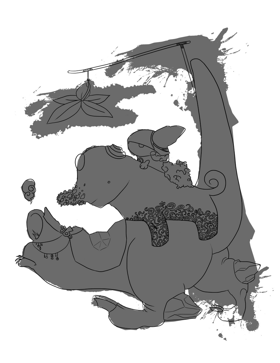
This particular competition was to create a piece based on an ink blot. You could rotate and resize the blob, but it had to be used as inspiration. Some people took liberties, and just incorporated the ink blot into a different piece (one case of it used as a cow's markings) but most people took the shapes and tried to make something out of them.
The original ink blot:
My interpretation, overlayed:
And I've got to say, it was HARD.
This has probably been one of the most trialing, awkward pieces I've ever had to do! First, interpreting the shape, I began with the little girl, though my initial idea was a bunny... Yeah. Then, the elephant just made sense with that short 'trunk' coming out, but I had to do something with all the bumps. With this, I decided to turn it into a jeweled, sequined toy elephant for the, now decided, girl!
The last shape was the worst, as initially I ignored the back leg which, of-course, made it look far too cartoon-y and silly (the 5-year-olds-profile interpretation of animals, where the forefront leg completely obscured the back leg). Adding the back leg was very awkward though, and left me a little out of the bounds of the ink blot.
The overall character ideas and creature concept are in styles I've never tried before and ended up looking like a child's book cover, which I'm surprisingly happy with!
Oh! And the COLOURS. My LORD colour theory bit me in the ass with this piece.
I originally wanted the girl to have orange hair, and green clothes. A purple elephant. And a yellow monster.
It clashes SO HARD.
Deciding on a gradiented effect has to be one of the better ideas on this piece, and I think it's subtle enough yet pulls the whole image together.
That's all for today!
Though, if anyone cares, the 'official' story of this piece: Not really based on Red Riding Hood in any way, here we have a girl who made her way into the middle of the hot jungle with her giant stuffed elephant. However, the heat got the better of them, and that's when a Golden Jungler (such an original name!) came to their rescue. Red Riding Hood even managed to attach a mini sun-blocking shade to the Jungler's tail for her sweet toy's health.
Labels:
Picture Included
Thursday, 25 August 2011
It's getting late
And I'm afraid I'm still working on the piece I was hoping to post today :< It'll be up tomorrow! But for now, you get:
It's just SO DAMN GRUMPY!
Henyway, I (officially) had my last day of volunteering today! I'm still going in on the bank holiday Monday to sort out some extra work before my holiday on the Tuesday, but today was the last day I was in to see everyone and get the main bulk of work finished. Being (likely) the last time I would see my supervisor, I got her a cake to thank her for looking after me over the summer and generally making it all an enjoyable experience, and as an added bonus she's agreed to act as a future reference for me!
As such, all is well in the world at the moment, minus grumpy llama taking the place of any real art today...
Enjoy!
Labels:
Picture Included
Wednesday, 24 August 2011
Dawww
Created for The Monthly Dragon Challenge on DeviantArt, one of the stocks this time around was a Lupin plant. As such, here we have a small, chubby yet VERY badly camouflaged dragon.
I really enjoy the colours in this one and particularly had fun creating the semi-transparent buds on the ears! They're meant to harden into horns as the dragon grows, same process as the claws and bud on the end of the tail~
I also did quite a lot of image enhancing with this piece. I try to stay away from messing with the hue/saturation/shading/contrast in the options menus too much as I like learning how to do it myself, however playing around with it on this piece on the background layer gave the interesting look to the flowers we see, which I'm rather happy with. :)
On that note, I'm reminded of when, in university, we had it hammered into us that we shouldn't have meaningless preferences and act fan-boyish to things. If you know VB and C, and feel you're not a 'real' programmer if you don't work in C for everything, then that incredibly-simple-to-program-windows-form is always going to take you far too long because you can't let go of your pride. Because of this, I'm happy to go out of the bounds of 'this doesn't feel like learning...' and just do the option that looks right. I learnt a lot in this piece regardless and I can't improve if I don't accept knowing what a better picture looks like, right?
Labels:
Picture Included
Tuesday, 23 August 2011
Drogo Reimagined?
I can't be the only one who thought this?
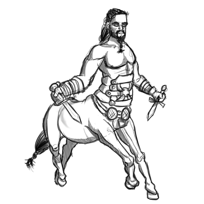
I've never read the books, so the series on Sky Atlantic was the first I'd seen of Game of Thrones.
Now, when Kahl Drogo is first talked about, he's referred to (in layman's terms!) the 'Ruler of the Horse People', or something along those lines.
Then, when he first meets to future Kahlissi and brother blondey-gold-face, we get the first sight of Drogo. The way it was filmed was to show a very dark shot of them in the distance, then the horses hooves, then Drogo's face. Seeing these aspects together made me go 'OMG CENTAUR YAY' in my head for a good 10 seconds until we finally saw the shot to prove he wasn't actually a part of the horse...lame.
Labels:
Picture Included
Monday, 22 August 2011
In too deep
I play FAR too much League of Legends. Currently, I'm mainly playing as Singed while The Boy tends to play as Ashe. This lead onto a 'DAT ASHE' joke which became a mini comic far too late at night, which was later deleted due to it just being atrocious. However, this image survived and I'm rather happy with it!
I feel the proportions are cute without being chibi, the S-curve through the piece (predominantly through the head, chest and down her right leg, being where the weight is distributed) gives it a nice shape and I think the EXTREMELY simple shading nicely adds a bit of depth to the piece.
The background also turned out as I'd hoped, being an incredibly simple idea but giving a strong sense of there being a full structure there, and showing where the 'wall' stops and floor begins by simply ~not~ drawing anything has come off well!
That's all for today, join me tomorrow for some Game of Thrones art!
Labels:
Picture Included
Sunday, 21 August 2011
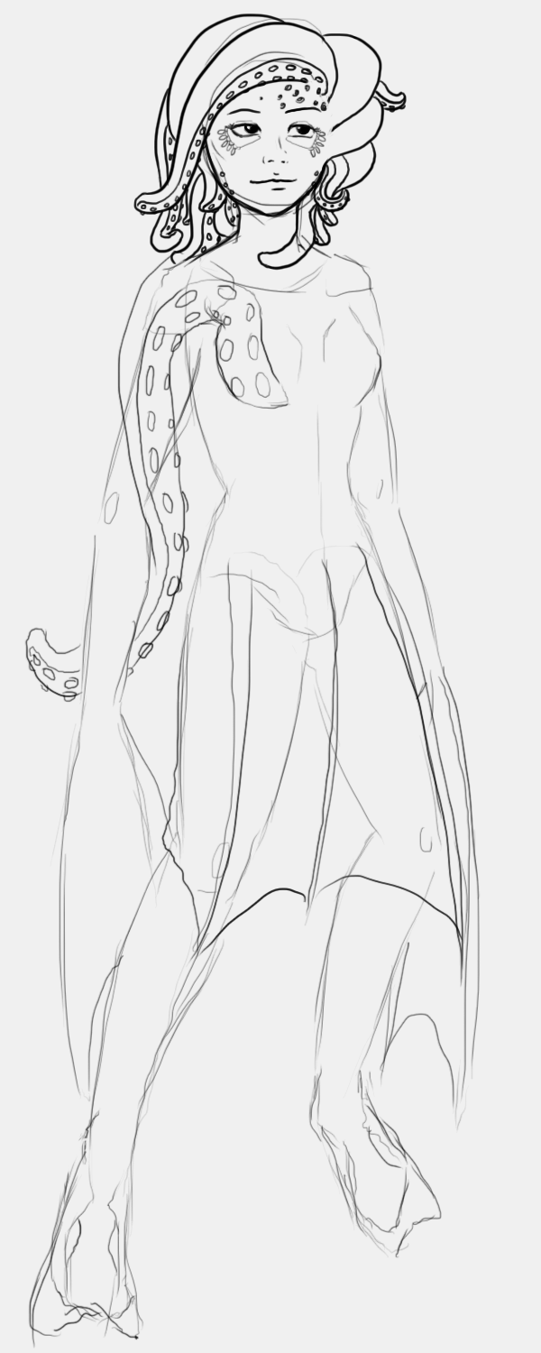
Octopus Maiden Part 3
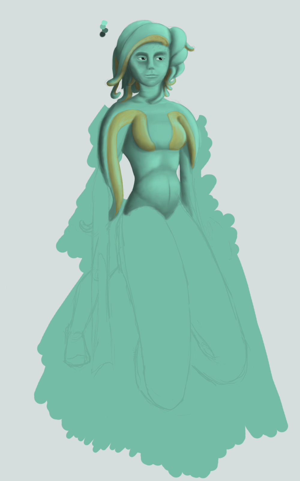
The latest version! As you can see, I've reshaped and re-sized the piece a bit, changed the hands since the initial piece and, most noticeably, changed the structure of the legs. As you can see, she's got a more balanced weight-distribution now, being over 2 legs and 2 tentacles, though I'm still not 100% happy with how it looks and, as such, havn't begun shading this area yet.
While I play around with it though, I've been colouring in the inner areas of the tentacles, defining more shading and highlighting, done some darker, higher contrast shading since yesterday, and started work on the eyes and mouth.
The next time I post this WIP will be in a few days, till then I'm finishing off the chibi sprites commission and working on a few other small pieces, including another piece of Mousehunt fan-art.
Labels:
Picture Included
Saturday, 20 August 2011
Octopus Maiden Part 2
Still working on this piece!
Finally made some progress with it, as such I've started shading and highlighting, refining some of the details and I've completely re-structured the piece from the ribs down. I've made her stomach more protruded to give her an increasingly grotesque figure, and she's now balancing on 2 legs and 2 tentacles.
I've also worked a bit more on the commission from yesterday and should have that finished in an hour, may post it up tomorrow unless I make a large amount of progress on this lass, in which case you can expect to see a lot more of her!
Labels:
Picture Included
Friday, 19 August 2011
Just a bunch of dots
The objects in my pixel brush pack so far!
There's still about 2 rooms left to go, plus a 'misc' tab which will cover everything from windows to radiators.
I've also been taking some commission work over at gaiaonline.com, and at the moment have been working on some sprites:
So looks like I'm fully stuck in the world of pixel artwork for a little bit longer! I'm hoping to make some real progression on the octopus maiden piece and a double-wallpaper in the next week, before I jet off on holiday.
Oh, on that note! While in Florida I'll still be trying to keep up with this blog, however it'll become once every 3-4 days with likely more text and only 1 picture a time I'm afraid, but at least it'll still keep going. :)
Labels:
Picture Included
Thursday, 18 August 2011
Mousehunt revisited!
I did some Mousehunt fan-art a while ago: Here, when I posted the original I included a post about what Mousehunt is and the like, so I won't be repeating myself here! Overall though, I'm still part of the MH community and have always enjoyed the art styles used by Hitgrab, particularly the work of Jacob Johnson.
As such, with these 2 fan-art pieces I've been attempting to emulate his style and I think I'm getting close. Though compared to my first image, done a few months ago now, I have to say my composition has definitely improved! The shadows feel like they exist for a reason and help to create the depth of the piece, while the lighting in general I feel has gotten better. You can also tell where the mouses eyes are easier in this piece...
Also, I've almost finished my pixel brush pack now, I would say it'd be done by this weekend but I'm going to see The Sister tomorrow so won't be functional till Saturday. As such, it'll be an early post tomorrow with the pixel work completed so far!
Labels:
Picture Included
Wednesday, 17 August 2011
Octopus WIP
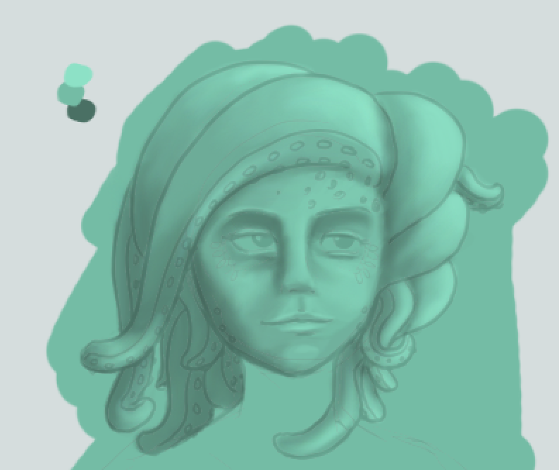
My current WIP, this is the very early stages with the basic anatomy sketch plus some additions to define the character design. I'll be removing the fin-skirt and smaller tentacles in the hair, as I don't think they quite fit the feel, and I'm still unsure about the suction-pad-milia around the eyes, but we'll see on that point.
I'm also considering re-jigging the legs into a different pose. I'll be adding 3 more tentacles, being a matching arm tentacle on her left arm and 2 leg tentacles, so she has 8 limbs in total. As such, instead of the floating-around-underwater pose we see here, I'm thinking having the human legs either far forward or far back and the body also resting on the 2 leg-tentacles, leaving a 4-limbed weight support structure. This way, I'll be able to play around more with weight distribution, and place the character on a beach rather than under water itself, as I've been doing a lot of pieces recently that have been situated under the ocean and very few featuring sand. This seems like a good time to rectify this!
I'm still unsure as to her finned hands and feet, but I love the flipper feeling of her feet so may well stick to this.
I'm still looking at underwater creatures though and considering placing the eyes at the side of the face rather than the front...But of course that would imply a herbivore, the victims of the system. On that note, I can't decide if she should be part of a terrifying monster set or a more benevolent being...
More to come!
Labels:
Picture Included
Tuesday, 16 August 2011
Some small commissions today
A small sprite commission, which is the first pixel character I've done for years! I don't think I did the shades dark enough...But I still think it ended up being pretty cute.
Then we get to this piece which I did for a contest~
Then we get to this piece which I did for a contest~
No idea what's meant to happen at this convention, or even where it's held, all I know is this art has a chance of being used for a poster for the event!
Also, it's one of the only pieces of anime art I've done recently and I'm really starting to think I've outgrown it... It's a shame as it's one of the styles which got me into art in the first place, but after studying paintings and life studies it all feels like such an easy style now.
I think that's the main problem, it's easy. I don't think I can improve upon it anymore so there's not really any point in doing it, other than ensuring I still CAN do it.
That's all for today! Look out for some more Mousehunt fan art tomorrow.
Labels:
Picture Included
Monday, 15 August 2011
Old piece revisited
The Boy tells me the new image looks a lot better, which it DOES, but I still don't like it. It feel dull, there isn't enough contrast, there's no reason for the light source I lit her with, and it just all feels a bit amateurish...
I will say, my hair's definitely improved over the last year! The composition's slightly better and at least corresponds to the rule of thirds now, but still...
Anyway, after drawing this I decided I wanted to draw something pretty, and quickly. So, 10 minutes later:
Only 5 saturations of the same blue used on different opacities with 2 different brushes in 10 minutes, feeling much better after this!
Labels:
Picture Included
Sunday, 14 August 2011
It looks like a cheap fantasy book cover
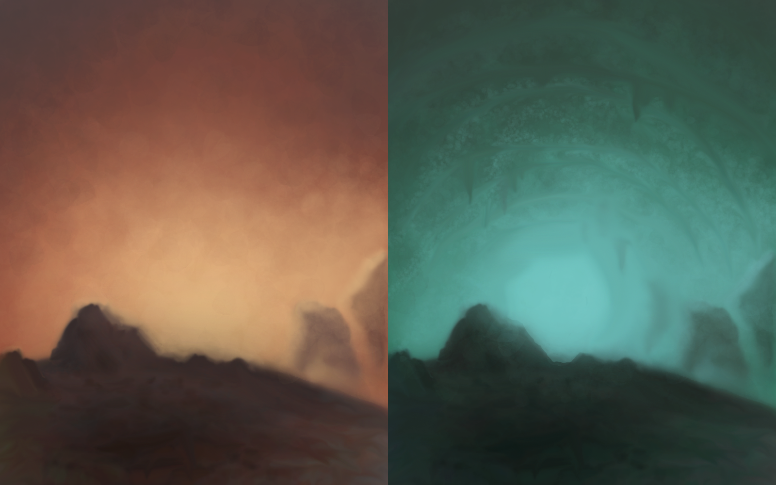
I loved creating these, specifically creating the (in my opinion) great colour palettes, and showing them side by side creates a great sense of contrast!
The image on the left was created first, in which I used an...interesting technique to create the almost smoky effect in the background, which consisted of using a wide leaf brush on low opacity (5%) and layering it at different sizes over and over while changing the saturation to match where in the image I'm highlighting~ but I digress.
The image on the right is a duplicate with the hue shifted, smudge used to create the stalactites and more, smaller texturing used on the ceiling.
I'm completely set in the idea of this being ideal for one of those 50p sci-fi books you can pick up from charity shops though...
Labels:
Picture Included
Saturday, 13 August 2011
Still working on the pixel brush pack
I WAS going to post a head shot today, but it ended up being a complete failure around an hour and a half in. I learnt a lot from it though! Greens and blues ARE present in the shaded ares of the face, but mainly on the more start edges compared to the angle to the light, not in the soft shading I was attempting around the cheeks which looked incredibly odd. :<
I have, however, been continuing work on my pixel brush pack and have 2 room 'sets' completed so far!
There's still 'Kitchen', 'Bedroom', 'Bathroom' and 'Other' to do yet! I've also decided that I'll likely create a garden set after this is complete, but I'll only release it depending on how popular this set gets. :)
As mentioned previously, the brush pack will be available for download through my DeviantArt account, with instructions on how to load and use them.
That's all for today! God I've spent so much of today looking at tutorials it's not even funny. D: I DID, however, also find the time to read a brilliant online manga. It's incomplete at the moment but you can find Haru Sari, the graphic novel, by clicking here. Apparently it's spanned 6 years so far with the first chapters being written in 2005, though it's certainly a recent discovery for me!
Labels:
Picture Included
Friday, 12 August 2011
I had the day off today..
So it seems I forgot to do my blog post! Sorry for being, as of ~now~, 49 minutes late, but better late than never!
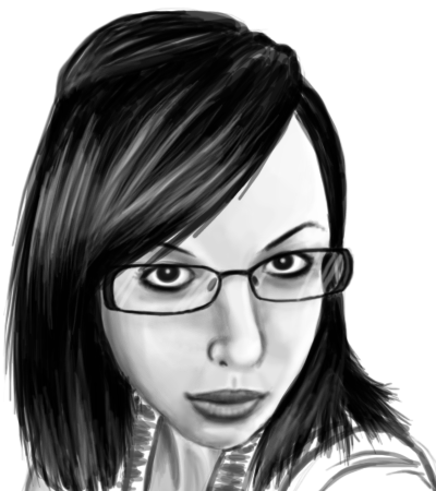
After the figure drawing class I attended a while ago, I've been itching to do some more life studies, however it was far too rainy to go outdoors today, so I had to make do with getting images from my best friend's and sister's facebook profiles. :P
As such, I present, The Steen:
And, The Sister!
Both have (thankfully!) received positive responses from thevictims recipients, and personally, I'm rather proud! Ofcourse, being eyeballed from the originals, I feel I should take too much credit, though the same would have to be said of all life drawings (and even photographs!) if that were the case.
I'm not particularly happy with the hair on either, mainly as I'm used to creating very crisp, almost strand-by-strand looking hairstyles, which I didn't let myself do with these as I felt it wouldn't suit the feel of the pieces.
That's all for today! Apologies again for the late update! And I'm working on a pixel brush set at the moment, all isometric, that will be available on my DeviantArt page when it's finished. Wish me luck!
After the figure drawing class I attended a while ago, I've been itching to do some more life studies, however it was far too rainy to go outdoors today, so I had to make do with getting images from my best friend's and sister's facebook profiles. :P
As such, I present, The Steen:
And, The Sister!
Both have (thankfully!) received positive responses from the
I'm not particularly happy with the hair on either, mainly as I'm used to creating very crisp, almost strand-by-strand looking hairstyles, which I didn't let myself do with these as I felt it wouldn't suit the feel of the pieces.
That's all for today! Apologies again for the late update! And I'm working on a pixel brush set at the moment, all isometric, that will be available on my DeviantArt page when it's finished. Wish me luck!
Labels:
Picture Included
Thursday, 11 August 2011
Back to 'real' art!
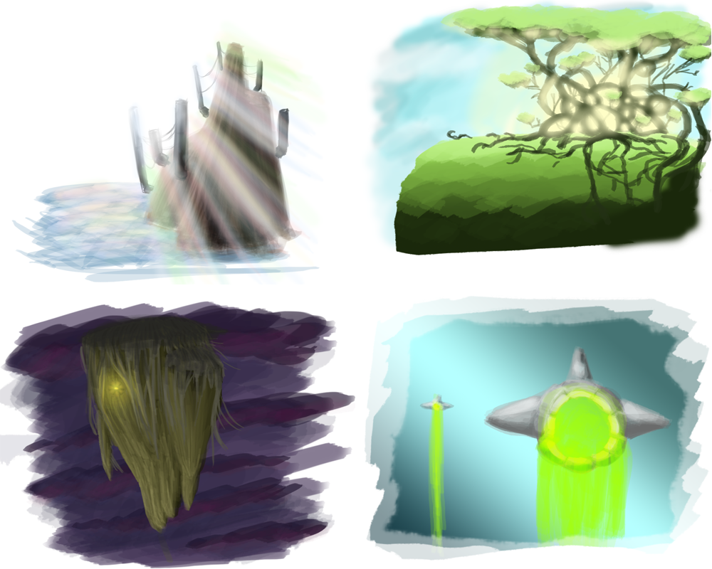
Decided to get back to work with some speed painting today! Mapping out basic compositions and colour sets then going to town with lights can be VERY fun, particularly in creating the upper right and lower left pieces! Both turned out better than I expected, but of course they're incredibly rough.
When creating the base colour sets for a piece I tend to drop by http://kuler.adobe.com/, followed by experimenting with gradients (most prominent in the lower right image, using my personal pre-set base for water based images).
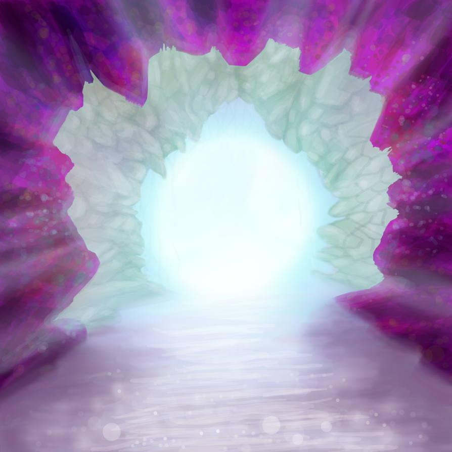
After working on these, I was in the mood for creating something a bit more substantial, so I give you 'Cave' (I'm great with names)
Creating the texture of the foreground was very fun, with a LOT of layers accounting for the multitude of effects used. I'm still not quite happy with the water, but I'm happy with how I did the shadows of the cave onto the water at least.
Labels:
Picture Included
Wednesday, 10 August 2011
All hail our cephlopod overlords
I'm enjoying this whole pixel business far too much. As such, I recently joined http://www.pixeljoint.com/ , there's so much good pixel work there! However, I've only done pixel art for the last 3 days now (being newly addicted to LoL doesn't help, time-wise ><) so I'm going to stop for tomorrow and return to the traditional digital work.
I've got loads of ideas I want to get down in the next 3 weeks, so time to step it up a notch! As such, I'm cutting my volunteering days from 5 down to 3, giving myself Tuesdays, Fridays and the weekend all free to work on art!
Wish me luck.
I've got loads of ideas I want to get down in the next 3 weeks, so time to step it up a notch! As such, I'm cutting my volunteering days from 5 down to 3, giving myself Tuesdays, Fridays and the weekend all free to work on art!
Wish me luck.
Labels:
Picture Included
Tuesday, 9 August 2011
Playing With Pixels...Again
What can I say? I'm REALLY enjoying pixel art at the moment, particularly as I revisited some of my favorite pixels artists yesterday and found some new ones today. :)
There's certainly a good level of skill required to make interesting pixel art, something I don't have yet. :P But it's another thing I can challenge myself to get better at!
I'm also rather proud that I used no pre-set brushes or the like today! My colours are a bit hap-hazard though, particularly as I tried to stay with web-safe colours for the most part (only 2 arn't) but that's really limits soft-shading options.
Labels:
Picture Included
Monday, 8 August 2011
Perfect Pixelated Places
Created with the help of a brush set from a lovely DeviantArtist, here we have a selection of (raised platform) kitchens using multiple colour schemes! The lower-right 3 were the first ones designed, with the lowest-right being chosen to be extrapolated on into the top left image, with a lovely Japanese theme.
Though I'd want more work counters than this... And a larger dining table in the main room (though the little square table with the plush seats would be for breakfast and the like!
A separate fridge and freezer would be nice too...
I'm rambling again.
It was back to work today after my holiday at The Boys! And my knees hurt... Not a good sign!
Mind you, it DID rain today.
Maybe I'm just getting older.
Labels:
Picture Included
Sunday, 7 August 2011
TLDR
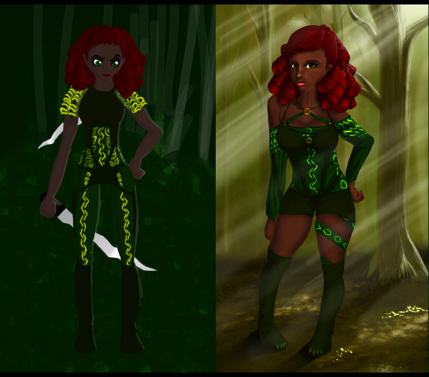
I finally finished it! It literally took me days to complete, with it's overall creation time spanning well over a week, but it's finally done! And you know what? For once, I'm almost completely happy with a picture!
Saying that, I'm sure in a year I'll revisit this piece and, hopefully, re-make it again even better. :)
I'm happy that I finally incorporated a character into a background, I'm happy with how the image progressed as a whole, I'm happy with the composition and the lighting, and I'm really happy with the floor!
Now, this has all been a mini project for myself to compare how I've grown as an artist in the past year and, I have to say, it's a LOT.
'Poison Ivy' was the original, and was actually the first time I ever attempted dreadlocks (as mentioned in a previous post). This was way back in the days of not caring about, and therefore not even starting to attempt environments around the character. I generally thought 'green = jungle' and left it at that.
That being said, although the original image is, well, it's really not that great is it? I decided it should be the start of the then-and-now as it DID have potential. I likes the idea of her character, she almost feels like an NPC your could get to join your party in Baulders Gate... I'm rambling.
Anyway, I tried to stay true to the original in many ways. Sure, I substituted the jungle for a forest, and ages her 2 or 3 years, but generally I kept to the theme pieces of the original. The glowing parts of the outfit have been reduced in number but accentuated, giving the same feel of a fantasy forest piece, though ofcourse now the clothing actually had folds and contours!
I did, however, feel the over-bodice should keep to it's original swim-suit material feel, and while I kept the stretched pieces of fabric I've re-positioned them to make slightly more sense now.
The boots are still knee-high silky fabric, but 'cat claws' have been sewn into the end to carry on the colour theme and give an interest point to the feer.
Overall, I feel this piece is generally a more mature version of the original, and, hopefully you'll agree, shows the progression I've made over the past year in terms of environments, character design and skin tones and textures.
Labels:
Picture Included
Saturday, 6 August 2011
Busy busy bees
I'm afraid I'm working on a large piece (the current WIP I've been working on for daaaays) so no real update today, other than Sonya Sones replied to me and told me she most certainly hadn't given any fans a lock of her hair, so unless someone's been incredibly sneaky, I now feel perfectly happy to throw away the DNA I apparently own.
Labels:
Picture Included
Friday, 5 August 2011
Sonya Sones? To the lost and found please
I'm a rather large Sonya Sones fan.
She's an author of some of the books that I've read over and over while I was growing up, and recently I purchased her 2 latest ones..
I read through them both yesterday...
One in the afternoon, and one at 1:30 till around 3:00 as I couldn't sleep.
(I miss The Boy a lot, even though I only just got back from a mini holiday at his yesterday...)
ANYWAY
She's a brilliant author.
I'm a huge fan.
And, well, apparently so is someone else.
You see, I'm a cheapskate, so both the book copies I bought were second hand.
Apparently in good or best quality.
But certainly used.
I personally find books like this endearing.
I don't want a dog-eared copy.
But there's a few corner-turned bookmarked pages.
The edges are just the tiny bit worn.
And it lets me feel that ~I~ can turn it into a dog-eared copy.
But imagine my surprise at 1:30am, when I open the second book, and there it is.
Her signature!
I didn't believe it at first, but the blue pen's even leaked through to the second page.
So, I'm pretty happy.
Then I turn the page.
AND A LOCK OF HAIR FALLS OUT.
SERIOUSLY.
I THINK I MAY HAVE A LOCK OF SONYA SONES HAIR D:
I'm not a stalker, nor do I want the hair, but I kinda want to know if it IS hers.
Looking at images of her online, it's the wrong shade, but she COULD dye her hair...
Google images shows some younger images of her with a shade close to this....
What do I do?
I think I might e-mail her.
'Miss Sones? I have your hair.'
...I'll post some photos of this escapade tomorrow.
As for today, it IS an art blog after all!
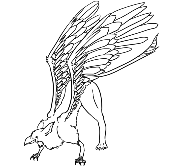
Have a griffon!
Unfortunately, I don't have a lot to say about this piece, as I entered this piece for a competition in which we were told to draw line-art of 1 of 3 source images.
I got to choose the pose though! I've always likes the idea of griffons having strong (but not fat, like dragons) back legs, so tried to emphasis this with a stretched-pose.
Labels:
Picture Included
Thursday, 4 August 2011
Under the sea again!
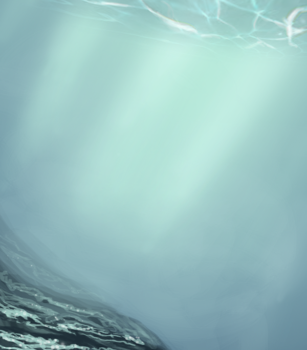
Went for a more...realistic piece this time around. A pretty bare scene at first glance, I'm mainly trying to work with the space to give the feeling that you're seeing a greater picture (sounds...rather strange, but by giving the viewer less to focus on, you either feel yourself within the image as a whole (what I'm aiming for!), or...you skip past it).
I made sure to have a drastic fade-off of the rocks covered in sparkling seaweed to imply the distance you're looking into, and tried my hand at the beautiful ripple effects you get from looking up when underwater, or from looking down at fairly shallow water...Anyway. You might be able to see a faint rainbow-ing at the main light sources I'm rather pleased with.
On a side note, I was on 2 trains and did a LOT of doodling, none of which is worth posting here, but I extrapolated one particular set of squiggles into this:
That is, indeed, a Ghastly :)
Labels:
Picture Included
Wednesday, 3 August 2011
Underground Dragon
I'm sure I've mentioned before that I take part in a monthly competition on DeviantArt called the Dragon Challenge, but if I haven't, it exists here: http://thedragonchallenge.deviantart.com/
It's a great little contest that gives you 3 stock images per month, you don't have to use all 3 but you have to use at least 1, and you create a dragon based on them. It's lovely for working to a specification but still letting the creative juices flow!
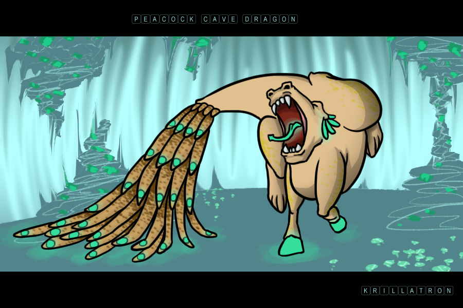
This month's contest was based on images of a cat, a peacock and a mushroom, of which I opted for using the peacock, primarily, and the mushroom as a secondary for aspects of the background.
Labels:
Picture Included
Late Update!
At the boys so didn't have a lot of time for art today! But here's a speed painted tiny planet (VERY Tiny, hell it's a rock more than it is a planet, but don't say that to Pluto :<).
Science time!
I recently had a conversation with The Boy (I say recently, it's a bit of a recurring conversation) about a plant grown in anti-grav. It's been proven on the shuttle flights that plants use gravity to determine up and down, and random, unorganized growths appear otherwise (except in the case of common roof moss : http://www.redorbit.com/news/science/122510/growing_plants_in_zero_gravity/) but I'm wondering about what if a plant HAD been grown on earth till it was a sapling, then a sphere of the dirt it's in was suspended in anti-gravity, and the entire entity was surrounded by sunlight. Normally, once sprouted, plants will lean towards the sun (you can even see sunflowers turning during the day due to this) but if always surrounded, would it grow in all directions or carry on in the direction it's currently going, but with increased leaf sizes?
Labels:
Picture Included
Monday, 1 August 2011
Ginger Hair and Turkeys
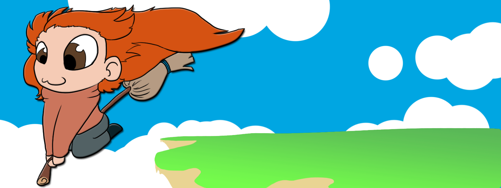
Well, I read all the books years ago and have seen all but the latest movie, and somehow Ginny has always managed to be my favourite character. I'm not an OMGI'LLDIEWITHOUTIT Harry Potter fan, but I enjoyed the fantasy, loved how the books aged with me (actually 1 year off, I was in year 6 when Harry Potter first entered Hogwarts, which is named after a plant! And seems obvious as such once you realise...) and as I'm now much older, I mainly appreciate how it got children to read!
And I'm sorry I'm still sticking to doing chibi work, promise it'll be something different tomorrow!
Also, I'm currently at The Boys, and we've just finished watching a VERY interesting TV show about a man who turned into a turkey (his words, not ours).
It was an interesting (social?) experiment and I hope some of his findings (that turkeys 'name' different environmental factors and other animals different things, and how their innate clock immaculately knows what stages in life they should enter when) are used as a basis for further animal 'experiments', in particular the idea of information (what other animals are harmful/harmless) being passed down genetically, something we've already had of note at happening to other birds, as well as elephants being able to walk a route to a specific location they've never been to and never been shown.
Labels:
Picture Included
Subscribe to:
Posts (Atom)
