I'm afraid it's the end of my Easter holiday, as such the updates will be much more infrequent between now and around the 4th June. I'll obviously still post up any work I am able to complete, but particularly over the next week I'm rather busy with a coursework hand-in, the completion and hand-in of my dissertation, moving back up to university after being home for the holiday, etc.
As this may be the last post for a while, I've decided to give it a slightly different structure. Instead of posting any art today, I've got a brief update on how my job search is going!
Well, while a lot of the larger gaming companies have no concept art jobs available at the moment, a lot of indie companies around England ARE hiring, as such I set off my CV and portfolio to 4 companies yesterday, and was able to have a very informative chat with a concept artist over at Hitgrab, who make my favourite social game on Facebook, 'Mousehunt'.
I'd been a large fan of his art for a long time, so it was an honor to get to speak to him. After asking him a few queries, I was able to find out that, while an Intuos of Cintiq is obviously a more professional set-up, I should be perfectly able to make professional quality work on my little Wacom Bamboo, though ofcourse the higher priced brands have higher pressure sensitivity, as such are likely worth the investment.
He reasserted that being a good artist requires putting a LOT of time in, and drawing at every opportunity, which is something I've heard repeatedly recently and has strengthened my resolve in art. I draw a lot and I enjoy it, and I tend to always have a sketchpad handy, so that should be that point covered!
He's also been working at Hitgrab for 3 years and has always loved his job, which is brilliant to hear. :)
That's all for today, hopefully I'll see you all again soon!
Tuesday, 26 April 2011
Monday, 25 April 2011
It's FASHION, my daaaaaaaaahlings..
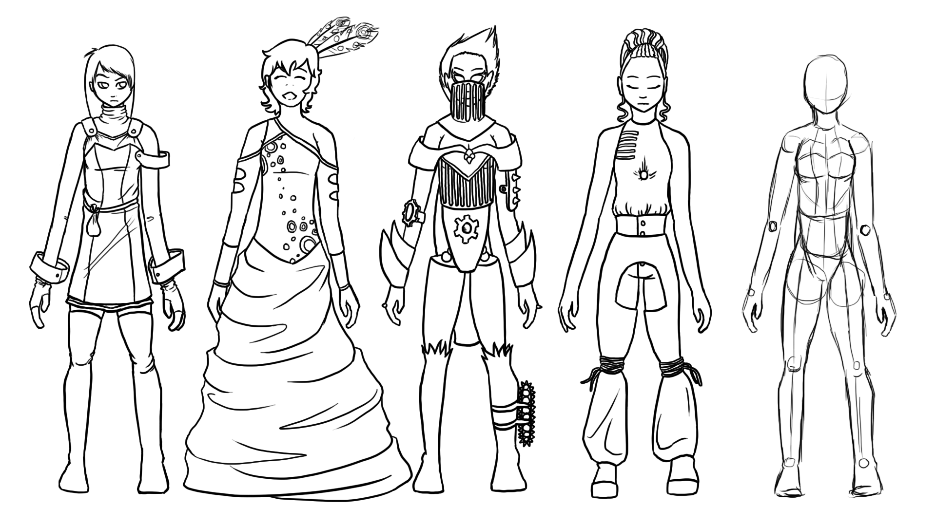
All based off the far right template, these designs are a trial-by-fire into costume design for a variety of fantasy characters. While hopefully you can figure out which each is meant to be by yourself, I'll also post the break down of each, from left to right:
That's all for today. At the moment I'm studying a bit of fashion design to get a better idea about silhouettes, unfortunately I've not found much that can be transferred into use in gaming so far but I'll keep trying. The reason for this all being that it's incredibly useful in gaming if the player can recognize the type of enemy they're coming up against from a long way away, particularly if colour can't be taken into account.
Thank you for reading!
- The Go-To NPC. She'll buy your trash, repair your gear, and give you a variety of smarmy come-backs to any non-business talk you attempt to partake in.
- The Beauty. She'll walk slowly around the streets in the latest prom-dress design like it's any other day, engaging you in conversation about architecture or the class structure of the city with no thought to the goblins rampaging into the city, nor the blood soaked rapier at your waist.
- The Weapon. Likely a boss encounter, this mechanized warrior will give you no quarter, as it happens to be what this steam-punk lady runs on.
- The Environmentalist. Will likely either be running the flower shop or lecturing you about the evils of eating a dragon flank. A truly annoying NPC to come across, especially as you wade through the mountains of dialog to reach the short piece of quest-related information.
That's all for today. At the moment I'm studying a bit of fashion design to get a better idea about silhouettes, unfortunately I've not found much that can be transferred into use in gaming so far but I'll keep trying. The reason for this all being that it's incredibly useful in gaming if the player can recognize the type of enemy they're coming up against from a long way away, particularly if colour can't be taken into account.
Thank you for reading!
Labels:
Picture Included
Sunday, 24 April 2011
3, it's a magic number
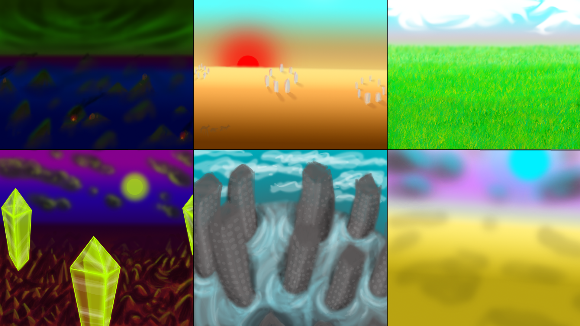
As promised yesterday, here's a collection of scenes, one of which (or a modified version of one) may be used as the background for a computer wallpaper I'm designing for my sister.
There was a lot of playing with proportions and lighting with these, as well as trying to not put too much colour into any individual image. Personally, from how I feel looking at these images, a variation of the lower left is likely to be used. The continuation of the green colour through the scene via the glowing crystals, reinforced by the reflection of the light from the clouds and mountains make this a pleasant scene to look at.
Next, we have some fan art I've been working on:
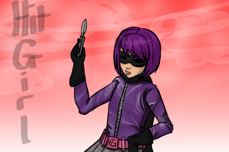
Hit Girl from Kick Ass, had some fun working on the sky in this piece which makes for a pleasant background to the image without detracting from the subject. The light, pinkish colour has been used to reinforce her youth. I always find leather effects a bit of a trial, and while the multiple creases and folds are interesting to work with, I'm never quite sure how to handle the large, flat regions. I went for a few small folds but mainly worked with a faint light source to reinforce the depth of the character and stop it from looking flat.
And finally, a more realistic piece:
Not based on anyone in particular, but The Boy is always telling me to work with more contrast in my pieces so decided to go all out with this image. I particularly enjoyed lighting the hair (beard and eyebrows) in this piece, as you can probably tell, and I appreciate how much additional depth the bump on the top of the nostril gives to the image.
Happy Easter everyone!
Labels:
Picture Included
Saturday, 23 April 2011
My apologies (2)
Was worried I'd have to do another of these at some point, but my apologies for not being able to update the past two days, nor will I be able to upload any new art today. I've got a few new pieces up on my deviant art account (http://krillatron.deviantart.com/) however none of them are really worth discussing here.
I am, however, working on a new landscape piece to be the base of a wallpaper design (desktop, not real walls) for my sister. Some of the colour schemes will be familiar from the other landscape trial piece I did, however I'll be trying out a few new ideas too. Afraid I'm stuck in the idea of floating objects though... they just add so much to a fantasy landscape!
While I've been working on a few pieces of art not worth posting here, the main issue preventing me from uploading and discussing art is my dissertation, of which I'm almost finished with but also quickly approaching the deadline of. With this, on top of the revision I need to do for 2 exams this year, as well as a coursework to finish, I've unfortunately got quite a lot on my plate on the moment.
However, this isn't a blog about complaining, this is a blog about the trials I face attempting to break into the gaming industry.
On that front, I have some news! I've been in contact with 2 recruitment agencies, both of whom have given me contact email addresses of people within the company who seem enthused to help me. Being told you're an ideal candidate is certainly nice to hear this early in the game! I can't really start applying for full time work till after the holiday in September though, but am hoping to get some freelance contracts over summer.
That's all for today, hopefully the landscapes should be up tomorrow!
Tuesday, 19 April 2011
A foul fowl...
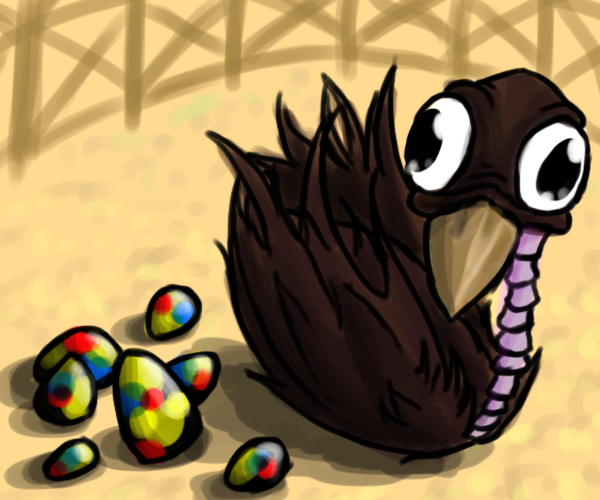
The culooka bird, a common pet usually owned by the vain. While naturally an unsightly bird, the eggs it lays have a great amount of value due to their brightly coloured shells. Originally, these would be hard boiled then set in varnish to keep their beautiful colours and shine, however this was recently classed under animal cruelty as the closer the eggs are to hatching, the more beautiful they become, and there were increasing amount of cases of the owners waiting till they could hear the live bird inside before beginning this appalling recipe.
The current preferred method is waiting till the eggs have hatched, then carefully piecing the shards of shell back together.
Decided to go for a single, finished piece rather than a bunch of monster sketches today, though can't promise the same for tomorrow. When I was considering what to draw, I was struggling over the ideas of predators vs. prey as that's not what we tend to encounter in daily life, hence going for a pet instead. The large, side-viewing eyes show this creature to be prey, and is a herbivore. A flightless creature, though it's retained it's wings.
The eggs were particularly fun to draw, as was creating the creature in an enclosure surrounded by fencing. It's rather unfortunate I wasn't able to spend more time on this piece, but, well, Portal 2 came out today, and it's time to show a certain special lady some affection.
Game on.
Labels:
Picture Included
Monday, 18 April 2011
Robot Unicorn Team Go!
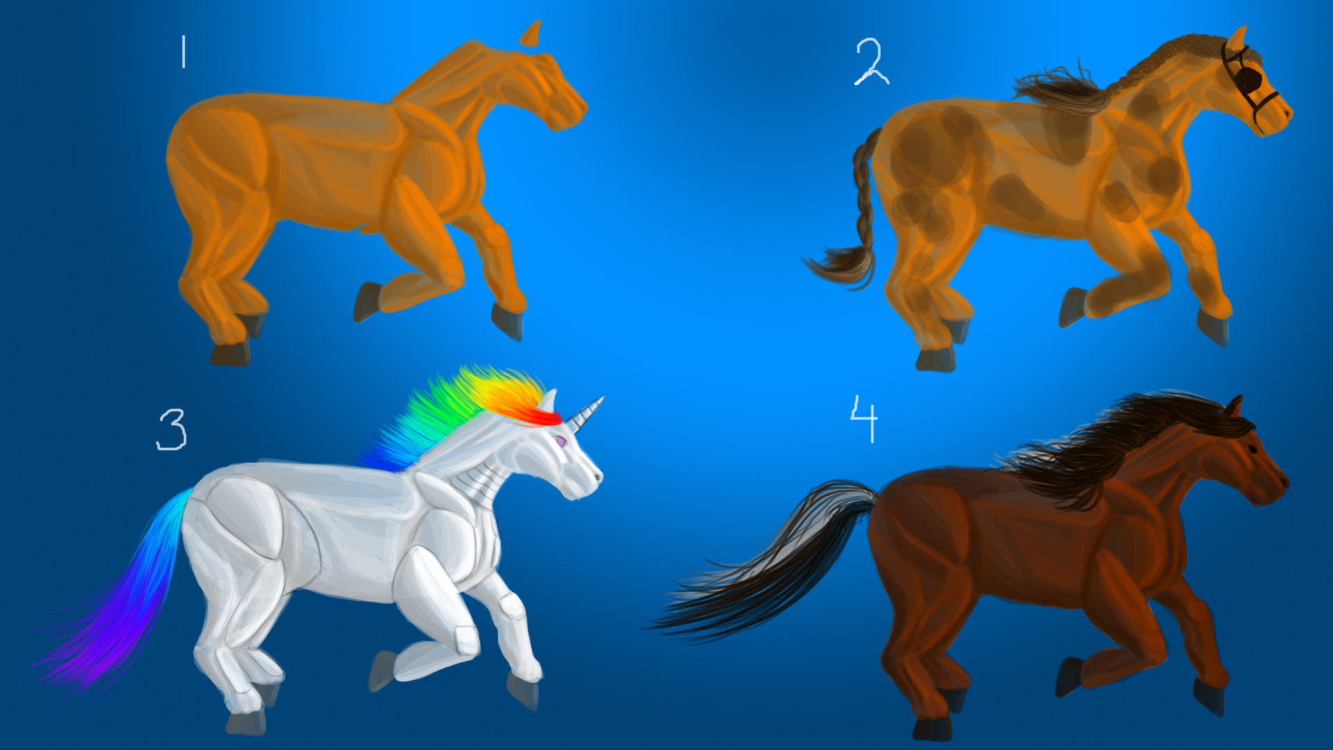
I've been studying anatomy recently and decided to attempt a few creature designs over the next few days. For today's piece I started safely within the realms of reality and created a horse base, which I then expanded into 3 complete designs.
With number one as a base (which took around an hour to complete), number 2 used the same base colour with patterning over the top and a braided-down show horse hair design, complete with blinkers. (This is starting to feel like a sales pitch...)
3 was, obviously, based on Robot Unicorn Attack (All rights pertaining to Adult Swim) while 4 was more of a challenge in terms of the hair, which was thoroughly enjoyable to complete.
Back to anatomy though, this was an exercise in attempting to draw what actually exists, whereas the next few days will be based on unique, new creatures.
As such, many things need to be taken into account...
With so many things to consider, I can see this being a very interesting challenge to partake in and hope you're all looking forward to this as much as I am!
With number one as a base (which took around an hour to complete), number 2 used the same base colour with patterning over the top and a braided-down show horse hair design, complete with blinkers. (This is starting to feel like a sales pitch...)
3 was, obviously, based on Robot Unicorn Attack (All rights pertaining to Adult Swim) while 4 was more of a challenge in terms of the hair, which was thoroughly enjoyable to complete.
Back to anatomy though, this was an exercise in attempting to draw what actually exists, whereas the next few days will be based on unique, new creatures.
As such, many things need to be taken into account...
- Structure. Bone and muscle, they need to be able to exist realistically, with accurate bone structures holding up a realistic muscular system. This can lead into other issues, such as...
- Stance, where is their weight falling? Are they 2-legged? 4-legged? More or less than these? Is the weight evenly distributed between the legs or are they running, purposely off-balance?
- What-ivore? Carnivore, herbivore, what will this creature be? Is it a predator who attacks through being a loud, heavy force to be reckoned with, or is it smaller, nimble and able to attack through stealth and speed? If a herbivore, is it structured as prey with wide-set eyes and good hearing, or are there no predators nearby to fear?
- Land, sea or sky? Mammal, bird or fish? Or does it take it's characteristics from insects?
- Does it feel the need to camouflage into its surroundings? Appear as if it's another creature?
- And so many more! Human-animal hybrids, purely alien creatures unlike anything we know on earth, the list goes on and on.
With so many things to consider, I can see this being a very interesting challenge to partake in and hope you're all looking forward to this as much as I am!
Labels:
Picture Included
Saturday, 16 April 2011
That's not a duck.
Click to view full size!
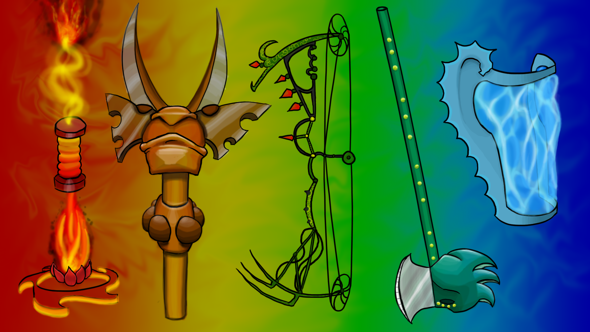
I decided to go for a 1080p wallpaper here, which gave me a lot more space to work with. I also decided to play around with an idea that's been floating around my head for a while, a series of images linked through a spectrum of colour. I then decided to use the word 'decided' less.
From left to right, we have:
- A mage staff, the central bar is held which also indicates the current stored 'fire power' (heh). The bottom disc spins to fuel the flame above it which feeds into the central bar, which powers the higher flame which is where the spells originate from. You could probably also whollop someone over the head with the really-hot-spiky end.
- A mace/axe/pole-arm combo. Two handed, to be held above and below the club-like center. Decided to base this weapon on the idea of a truly 3D weapon, in the sense of being able to attack no matter where the enemy is to you. Are they trying to flank you? Spin around and slice them with the axe! Coming in from the front? Slice through them with the pole-arm! And if they've unfortunately got in too close to be maimed by the axe or pole-arm, give them a whollop with the mace.
- A compound bow. Not much to say here, The Boy suggested it be dark and spiky so that's what we have. I tried to go for a poison ivy feel, though realize that left me with no-where for the owner to actually hold the bow... Well, the thorned, green and yellow bar 2 parts below the center is meant to be the hold and, as such, we can presume the owner is wearing thick gloves.
- A halberd! My favorite weapon due to it's ease of use (once you're got the initial momentum you can become a whirlwind of death), it's general look (guards just wouldn't look right in a suit of armor without a halberd) and the amount of design that can go into the head. I've been drawing halberds for years and this one's by far the most... imaginative? It's meant to be an ornate dragon head design with the maw becoming one of the blades and the spikes back of the head being the other side, though the more I look at it, the more it looks like a duck. I'm starting to think that green and yellow were unfortunate colour choices for this one.
- A water shield! Ignoring for a minute that there's no way to hold onto it or attach it to your body, as the water is suspended in a constantly flowing motion through the shield we can assume it'll magically adhere to the wearer. Now, ignore the fact it wouldn't deflect anything, it looks amazing!
Labels:
Picture Included
My apologies
Afraid there wasn't a post up yesterday, nor will there be any art shown today. In an unfortunate turn of events, I realized I could get another 2k words written on my 3rd year dissertation today and did that instead. Then I played some Minecraft, got my labyrinth finished... then I ate some soup
All VERY important things which took up my time today.
However, it's not all doom and gloom, I've started a piece you can look forward to seeing tomorrow! The current challenge is weaponry. Tomorrow's piece will comprise of an arsenal of fantasy weapons, enough to make any ogre rethink his strategy!
(I realize that, since we're talking about ogres, the main change will be from 'Food? RAWRGH!' to 'Food? RA...spiky...? ... RAWWWWGH!'.)
Anyway, it's a large piece, it's already taken me 2 hours, it's going to take me a while longer. If there's any chance, I'll get it up tonight but I'm not promising anything at this point. (Hur hur)
Thursday, 14 April 2011
Express yourself!
Click to see the full size image!
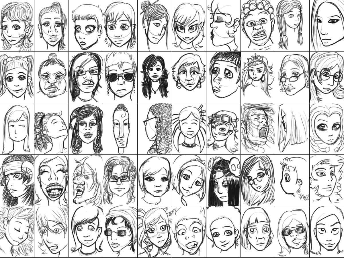
A continuation from yesterday's piece, 50 female faces showing a range of expressions and ages.I tried to stay away from the standard type of female face that I draw, which lead to a lot of mistakes when first starting these! Hairlines being the most common mistake I made, generally placing them far too low on the face. I'm also still learning how to draw lips and noses in simplified faces like these.
Hair was a fun one to play around with at least, and I got to draw some of my favorite styles here!
Personally, my favorite piece if the bottom left, one up. Horned bandana? Yes please!
As you've probably caught on to by now, every day I'm trying to challenge myself. Landscapes, speed drawing, all in the pursuit of knowledge. As such, while I still have a few ideas on other things to try (particularly aiming for more landscapes and non-humanoid monsters at the moment) I'd love to hear your ideas!
If you have a challenge to suggest, just post it in the comments, I'll get to it as fast as possible.
Labels:
Picture Included
Wednesday, 13 April 2011
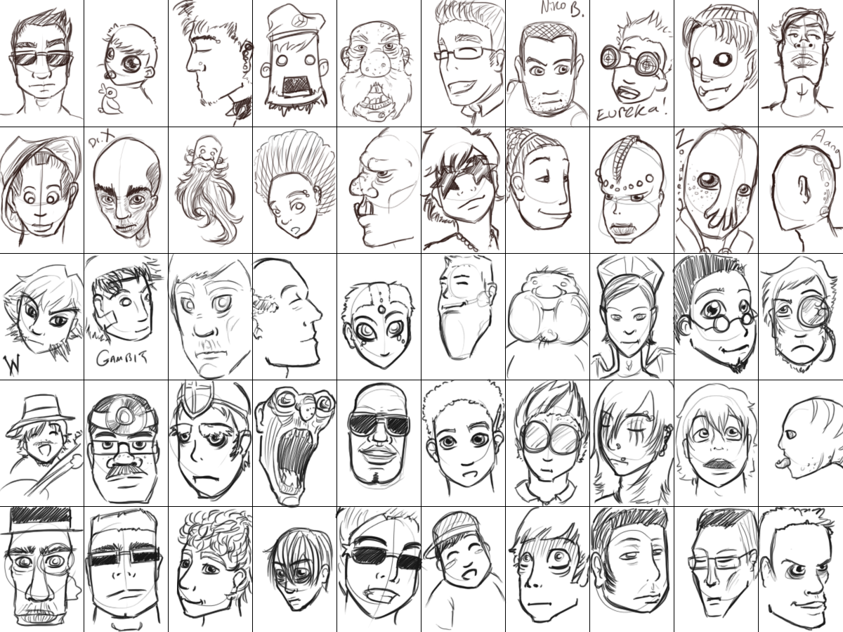
Express yourself!
~Click for full view!~
50 different male faces! An interesting challenge, particularly due to my dislike of drawing males. (No sexism here, but it's a well known theory that women are better at drawing women and same for men drawing men, I suppose due to prolonged exposure...but I digress)While one of my main struggles with the male form is the lack of curves (pronounced curves, at least) and continuous dis-proportioning of the rib-cage to the hips, to the length of the legs, another aspect of my dislike of this subject is I find it hard to see variety in the head area. With women, there's hair! Accessories! Piercings, make-up, all these things I couldn't give less of a damn about in real life come into their own when creating a character, but males?
Before this exercise, if I created a male character, they'd just look like a female character but with short hair and no eyelashes....
From sitting down, doing this exercise and thinking, REALLY thinking about the aspects of a male face, I thought of a few things to play around with!
Jawline! Typically squarer than the female equivalent, and sometimes covered in....
Hair! Facial hair gives the artist a LOT of freedom in creating a character, from goatees to sideburns, and that's not including the actual hair. I usually go for a short, brown, unkempt look, though I tried to do everything BUT that here, leading to afros, short-back-and-sides, anti-mo-hawk, balding, bald, crew cut and many more, some I don't think really exist...
Eyes! While many stay with my safe-zone, a simple manga-esque style, I tried some eye types here I usually stay away from. Small, round eyes, closed eyes, over-expressive eyes and, in some cases, sunglasses. ><
Adams Apple! An obvious sign of a male character, and while it has no real-life significance, overemphasizing the Adams apple on a character can make them seem more masculine, a nice little addition when aiming for a man's-man type.
Age! Now, here's a weird one for me. I usually base all my characters in the magical-Marvel age of 'I-don't-know,-somewhere-between-18-and-40-maybe?'. A timeless, unwrinkled look which generally translates as mid-twenties but with the stomach you had at 16 and thought would never leave. Adding wrinkles is obviously an easy way to turn a ageless character to permanently in the 60+ pool, how-ever other things need to be taken into account. Are the pores more open now then when they were young? Are they well-kept? Do they have young-whippersnappers on their lawn right now?
Proportions! The giant chin or huge cheeked characters may seem most prominent when first viewing this piece, and that's probably a good thing. Going back to an earlier blog post, images which take longer than a quick glance to 'figure out' and gather all the information from are a great ideal to aim for.
Expression! The Boy has recently commented that a lot of my work lacks expression, which I agree with. A lot of my work before this blog pertained me working with bodies, proportions and perspective, leaving me little care for how the character actually felt. This, unfortunatly, usually left the whole image feeling flat. For example:
An unfortunate piece, as I thoroughly enjoy Dragon Age and hope to do a better tribute at some point.
That's all for today!
Join me tomorrow for more explosive fun!
Labels:
Picture Included
Tuesday, 12 April 2011
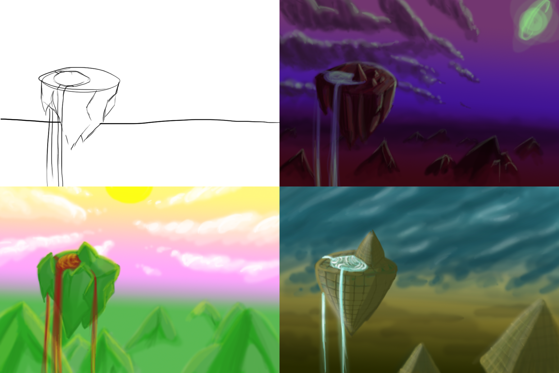
War of the Worlds
A bit of background practice, mainly a challenge in lighting, composition and reflective lights and shadows. Am most proud of the upper right image, both the way the light shines off the clouds, and the water pouring off the island.
I thoroughly enjoy doing quick pieces like these, and of course it's good practice on the environment side of concept art.
I actually enjoyed it so much I may well carry on with the same baseline for a future piece, stay tuned!
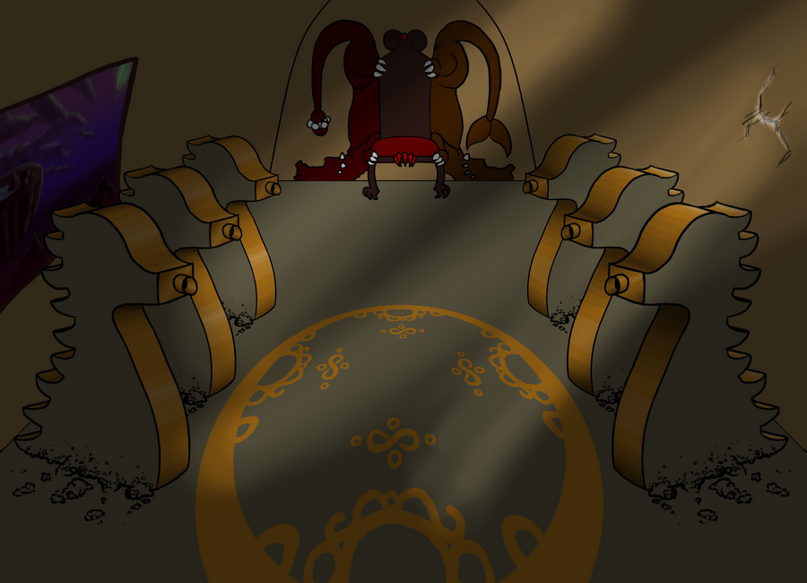
And, as a treat, the second image of the day, the revamped Dragon Throne Room!
I tidied up the lines, added (a LOT) more depth to the room, modified the chair rather heavily, and added a window on the left, leading out to the world.... recognize it?
I'm not 100% happy with the crack in the wall. I wanted to give the room a partially dilapidated feel (hence the rubble at the floor of the dragon statues) however don't think I pulled off the lighting effect quite correctly.
I always enjoy doing a shiny metal effect though, and the tubes in the dragons mouths are meant to be part of a booby-trap, which would breath fire on any usurpers of the throne.
That's it for today, join me tomorrow for what will likely be character art or a creature!
Labels:
Picture Included
Monday, 11 April 2011
Highway to the danger zone
It's the Easter Holidays at the moment and, as such, I've got a lot more free time now than I've been privileged to in the last few months. While I still have a 15,000 word report to write up, I'm already at 9k and am aiming to get 1-2k words per day, which still leaves me with a lot of free time.
As such, I'm trying to get 1 art piece done per day this Easter (where possible, Easter Sunday itself will be excluded, as will one day next week where I'm spending the day with The Steen).
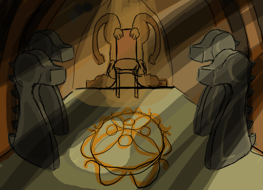
As such, the piece displayed above is yesterday's piece. Over today and tomorrow, I'm planning to turn it into a fully finished concept piece for a dragon-esque throne room. However, as that will be up and posted tomorrow, that leaves me with the image of today.
A small note before I continue: I've joined Sketchoholics, an online community of artists which holds frequent conpetitions, does artist interviews, has a means to promote your artist Youtube channel, and many more features. My username is, as presumed, Krillatron, and today I entered a piece for a competition titled Love or Death.
Some of the other entries had taken a very humorous take on this, some leaving me giggling audibly and earning me an annoyed look from a cat. Others were darker, but I felt some of them didn't take the name of the competition seriously, as such, I decided to create a piece pertaining as close to the name as possible, and went for a Hunchback of Notre Dame piece.
I very rarely play around with tinted line art and, as I'm trying to challenge myself in every piece, decided to revisit it. Personally I think the fire is in the wrong style for the piece, though the fiery-highlights work well in emphasizing the heat of the image.
Backgrounds are always a pain for me (hence the throne room image above, I figure if I design areas then put the characters in them I'll have an easier time then designing a background around a character) and while I feel the background compliments the image here, I think it could easily of been further improved by an image of the bell tower in the background. Perhaps next time...
Labels:
Picture Included
Thursday, 7 April 2011
These things I believe
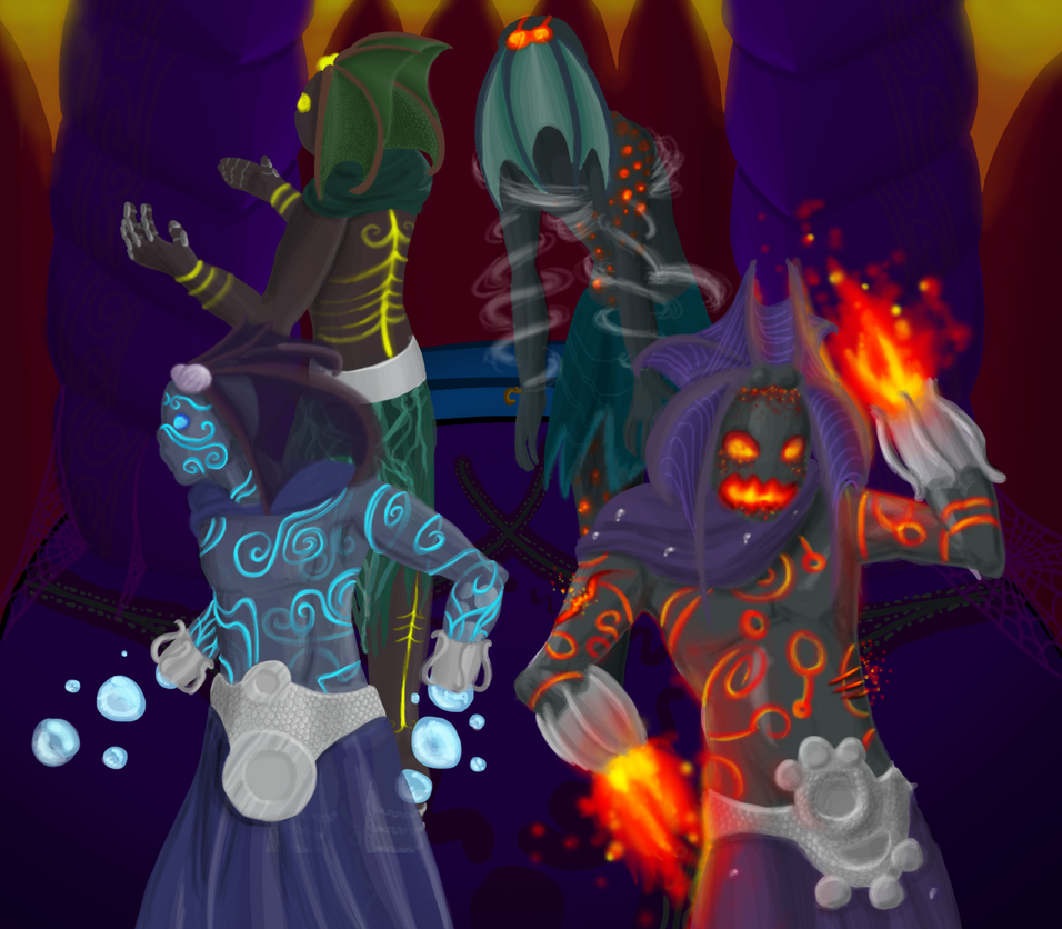
Most recent piece completed, took a few days overall to finish though didn't time myself hour by hour. If my music album is anything to judge by, it took around 7 hours.
Within this piece I incorporated a few bits of advice I've picked up, and completely ignored others.
What I did?
-Add layers of interest.
An image should take longer than a glance for the viewer to take in all the information, as such I included some interesting little effects to this piece, particularly in the water ascendant. The almost fully transparent head-fins are complimented by the semi-transparent skin, through which you can see the pattern swirling around the entire body. There are also bubbles inside the body which can be see in the foremost arm, which are being forced out to form the attack. The fire ascendant, as well as having blaze-effect patterns over his body, has suffered some wounds (on his waist and upper arm) which show his fiery blood angrily bubbling to the surface.
-Use complimentary and contrasting colours.
Unfortunatly, as this is a fan piece, most of the colour theory was done for me. The 2 characters on the right use strongly contrasting colours to highlight parts of their characters, the upper left (earth ascendant) uses complimentary colours (yellow and green through to brown) with contrast being drawn from the highlights and shades, while the water ascendant uses purely complimentary colours, only going from blue through to purple with greys. The background is largely based on the fire ascendant.
-Make the line-art crisp.
It's easy to lose details, and even body parts, to poorly drawn line-art. I've seen hands accidentally become hair and limbs drawn at the wrong depth, simply because the artist didn't display correctly what they meant by each line. When finishing off your line-art, get rid of EVERY line you don't need. If you won't be seeing it in the final piece, don't leave it in. You may well find the image changes a lot and you preferred it when it was busy with sketched lines, if this is the case then keep tweaking the final design till you're happy with it again. Using thicker lines to specify what is meant to be kept in the foreground is also an invaluable technique.
What I didn't do?
-Get a clear image of your mind of the composition early on.
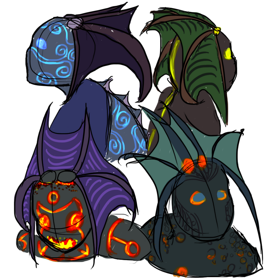
I completely ignored this, in this case, this image started as a few headshots:
Which I enjoyed so much I wanted to see what I could create with full body shots. They were originally going to all be displayed seperately, though 3 characters in I decided to make it a group shot, as is the case in the boss encounter. (I should probably explain here, these characters are based on the Twilight Ascendant Council in the Bastion of Twilight, a raid in World of Warcraft: Cataclysm, all character designs copyright to Blizzard ofcourse).
-Keep in mind the main lightsource.
Again, as I did these pieces predominantly seperately, I didn't keep this in mind at all.
-Create a character that a 5 year old can replicate after seeing the character once.
This is something I heard and always strive to do in my character designs, as it ensures enough -pop- in what you're doing. Having a character so simple, for all the features to stand out so strongly, isn't always adopted in the games industry, though it's something I'd certainly like to see more of. Ofcourse, I couldn't attain that level in this piece as I'm not using my own characters.
(Note: A lot of the time, it's not what you want in the gaming industry. The characters in many Japanese games (Final Fantasy being a nice point here) have surprisingly intricate character designs which show a feat in clothes design, modelling prowess and imagination.)
That's all for now, but you may see more the of lower right (air ascendant) character, I've had a few ideas pertaining to him...
Labels:
Picture Included
Subscribe to:
Posts (Atom)
