Saturday 28 May 2011

The mouse hunter becomes the...mouse hunted?

So, I've been addicted to a great little game called Mousehunt recently. If the last 2 years can be classed as recently. It's a social game on Facebook, you build a mouse trap out of a trap and base and use it to catch mice, it's simple early on but it builds you up into there being multiple mouse types (shadow, fire, water, tactical, etc.) which need specific trap types to counter them. You can also get charms to buff your trap and craft improved traps out of parts you find, or you can smash traps for parts to new traps too.
Anyway! I was speaking to one of the artists over at Hitgrab (the company who produces Mousehunt from out in Canada) and, after a great conversation about his work, the company and how to break into the industry, he commented that, while he liked my style, they hired people with a more painted-style.
The below 3 images are NOT produced by me, but were the reference pieces I used in creating the upmost image. The top piece is some fan art I did of the middle piece, the Pathfinder mouse of the Nerg tribe.
As such, what do you guys think? Is my art going in the right direction here?
Did I capture most of the feeling of the Pathfinder mouse?
Do you like the bad-ass dreadlocks?
Am I finally using enough contrast?

Sunday 22 May 2011

BRINKady-doo-dah


Finished it! Click to full screen.
Well, the BRINK image is complete, now with a more interesting Founder's Tower and super-cool-textured-colour-effects behind the characters. Also, the green head on the right is meant to be a mask, not an alien head as The Boy presumed.
The colour was achieved by adding in 2 new layers below the image layer. On the lowermost layer, a white-green-blue-white fill effect was used while a pure-white fill was used on the above layer. The erase tool used on the second layer completed the swirling effect. 
The texturing was a simple opacity-and-size-varying wet media white brush dabbed over the colour.

On another note, I found a great stock artist a while ago who goes by the DeviantArt moniker of SuannyStock 
She gracefully allowed me to use some of her stock to create this:


Which received more favorites faster than any other image I've put up on DeviantArt to date!
The erasing-through-the-layers trick was also used here.
Enjoy!

Saturday 21 May 2011

Brinky Todd

Challenge of the day: SPEED!
Completed in 30-45 minutes, in order to complete this piece I did no pre-planning and no erasing. If something was wrong, it was drawn over. Drawing straight with no line art is something I rarely do these days and I'd forgotten how fun it was. It's a good challenge, completing a part of a piece and having to compose all other parts of the image around it. No layers were used in this piece either, so any mistakes were well and truely permenant.
As such, the arms look a bit wrong. I drew them in such a way to be able to completely ignore the hands, as ill-drawn hands can ruin an image, however they appear to be at slightly the wrong angles. Also, as her torso is too short, the elbows seem to fall in the wrong place.

Overall, however, I'm glad with how this image turned out. It captured the spirit of the baker of Fleet Street, and I believe it's easily recognizable as Helena Bonham Carter from the 2007 movie.

Also, as a sneak peek of another image I'm working on:

I'll admit, I've been rather addicted to BRINK recently. I've been looking forward to it for almost 2 years now, since getting a sneak peek of it at Eurogamer. Was a tad disappointed that they'd not been able to complete all the female assets in time, however hopefully that will be patched in later. Though there WERE a lot of peasant surprises, particularly the detailed storyline available through playing the campaign and particularly from unlocking the audio logs. Being able to choose how your character sounds was also a great, unexpected advantage. Particularly as it's the first time I've seen this feature available outside of RPGs.
Being able to unlock most items within the first hour of playing through doing the challenges was a disappointment though, particularly at the easier, early challenges had more rewards than later ones.
Anyway, I could go on at length about BRINK, but as this is an art blog I'll leave it there for now. Hopefully this image will be finished by tomorrow!

Thursday 19 May 2011

RIFT

Today, a new competition started up on DeviantArt, in which the challenge is to create a new type of monster to act as a colossus in the popular MMORPG RIFT.
(As I've just learn how to, here's a link to buy the game!)
The contest will be up for a while longer, more details can be found [here].

The idea is to choose one of the 6 planars to base the colossus on, which is a creature who controls hoards of lesser beings, all of whom originate from a rift.
As I hope you would of been able to guess, this creature originates from the water plane.
And, in my effervescent wisdom, it's a sea horse.

The general shape of the body is, of course, that of a mix between a seahorse and a horse, though with the fore-leg joints being much higher than usual. I believe this gives it a more fantastic, unnatural feel. It's a very thin creature with it's rib cage, facial structure and muscles protruding.
While subtle, gold is a theme throughout the image, linking the golden eyes with the jewels on the fins, through to the shining effect of the skin.
The glassy, rainbow-esque hooves are a link back to the rainbow-tree I drew a while ago.
The general look of the entire piece is that of the concept art I saw from RIFT before creating it, which can be found [here]. With 2 perspective views showing important views of the creature, defining the concept well for potential 3D creation.

As a small additional note, the idea of the kelpie, a mythical bog creature which would occasionally take the form of a horse (also commonly a form of a woman) who would drag any who tried to catch it into the swamp to be devoured, was a strong inspiration for this piece.

Monday 16 May 2011

Now, for global domination...

First things first, it appears I now have readers from the UK, USA, Germany, France, China and Singapore! Thank you so much everyone for reading and I hope you continue enjoying this blog.

Now, onto business, as it were.
Yesterday, I mentioned the image used a compilation of the following things I've been working on recently:
  • Texturing
  • Lighting
  • Shadows
  • Contrast
  • Image Composition
  • Colour Theory
  • Backgrounds
I figured it may be a good idea to expand on a few of these to give you better idea of what I've been doing recently.

Texturing
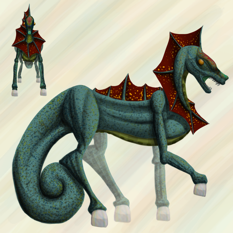
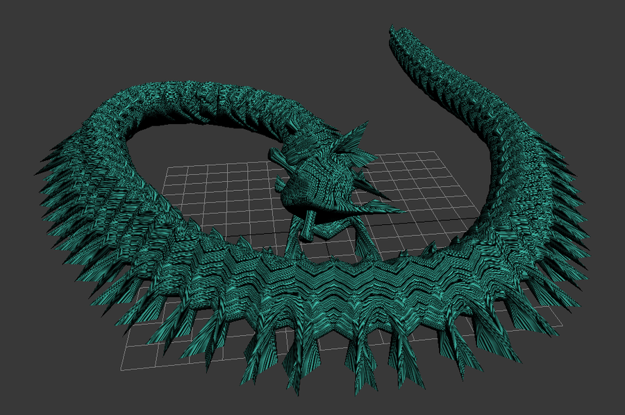
In the dragon scene, the texturing was incredibly easy. The main scale texture simply involved selecting the dragon, finding a suitable brush, increasing it's brush size (approx. 2000 pixels) and applying the texture to the dragon. Usually, you'd want to find a good, suitable texture (usually online, make sure you get permission if applicable) however in this case nothing more than a textured brush was needed.

Lighting/Shadows
Here, the main light source came from the green moon, however the red to purple horizon was also a light emitting source. The horizon implied being extended up into a purple sky, which was reflected into the fog below, whereas the stronger red and green sources were used as the main lighting points of the mountains, gryphons and dragon. Each retained a lot of their original colouring, though the edges closest to the light sources show the reflected colours. The clouds also show some colouring from the green moon, emphasizing the strength of the light source.

Contrast and Colour Theory
Colour theory dictates that colours on opposite ends of the spectrum compliment and contrast each other. Red is to Cyan//Green as Blue is to Orange. In fact, blue and orange is such a popular combination of complimentary colours it's set off a bit of a trend. A mini biology lesson: The human eye doesn't perceive all hues to be the same brightness, yellow seems naturally lighter than purple and so on. As such, orange and blue, as well as being of opposite hues, are also on opposite sides of our perceived view of brightness, making them a very dynamic contrast and possibly the strongest pair of complimentary colours available.
Within the dragon image, the green is used as a compliment to the red and purple hues, adding a point of interest in the sky. I also added the bright, contrasting moon to be a good light source to the gryphons, who would otherwise of been lost into the sky.

Image Composition
The rule of thirds comes heavily into play here. with the gryphons appearing on the upper-left cross section and the dragon taking up the lower right. There's also a very strong sense of purpose in the image (the dragon-predator and gryphon-prey) with the line-of-sight easily distinguishable between the two types of creature.

Backgrounds
Not much to say here, a background can introduce a strong sense of purpose to an image, through unless the scene contains feature points, try not to let them overshadow the main characters in the picture. Mergers are always a worry and should be avoided wherever possible.

That's all for today! Although: A small note I'd like to make is that there are many lifetimes worth of reading about good photo composition to be found online, though below I've included 2 particularly good websites with free, useful information about the subject. These lessons are invaluable both in photography and in digital artwork, and it's always worth keeping these ideas in mind when creating a piece.
Guidelines for Better Photographic Composition
How to Take a Good Photograph

Sunday 15 May 2011

It's HUGE.

[Click for full view]

At 2500x2000 pixels, this stands at the largest image I've ever worked on! I've compiled many of the things I've been working on recently, including:
  • Texturing
  • Lighting
  • Shadows
  • Contrast
  • Image Composition
  • Colour Theory
  • Backgrounds! 
This piece will actually be being printed out and presented to my dad who commissioned me over Easter to create a backdrop piece for his computer set up. As he's a large fan of fantasy games, and in particular specified he'd like to see a dragon, this seemed like a good direction to go in.
I've also entered it for a DeviantArt competition, wish me luck!

As a side note, I'm still rather busy at the moment but, as always, will keep posting images here whenever I can complete them. Though between revision for 2 exams, working on 2 projects with university friends and writing a paper about how to create a successful indie game, I doubt there will be frequent updates will June.

Wednesday 11 May 2011

Trees!

Well, I've been working on trees recently. Surely, the foundation of backgrounds for characters shouldn't be so complicated?
I've been having a bit of trouble getting the level of detail I want in the shading, while trying to avoid painting every individual leaf... Plus I may of completely discarded the rule of thirds in this image giving it a heavy-top feeling.
Overall though, I rather like this image. I got to incorporate the rainbow-bark onto the trees, which, as they're all leaning, I feel give a rather ethereal theme to the image.
Plus, the rainbow flowers in the lower left were enjoyable to draw.
Now, I've been recently thinking more into how to compose a piece as a whole, as such I wanted to create a character with a suitable background. As I wanted to go for a rough piece to practice this, I chose to use one of the 50 female faces I'd already created and do a larger image of it, then draw the background around it. The whole piece is rather rough with poor line art, but overall, I like the composition!
The contrasting colours of the green and orange work perfectly here, with the colour of the background reflected in her yellow eyes. Having the trees expanding away from her contribute to ensuring the scene doesn't appear either too crowded or too sparse, while also drawing the eye to her face.
The power-level horns and rainbow eye-edges were just because I thought they'd look cool.
I was right.

Wednesday 4 May 2011

Into a new dimension

It's already very early days, but it seems at every step I get a tad closer to the end of my search! I was recommended for a job in an animation studio today which, if I get the place, may start next week! As such, I've been revisiting 3DSMax and decided to re-run through the tutorials as I'd rather forgotten about many of the basics.
As such, the above dragon is what I came up with during said tutorials~ I had a simple figure that started off as a cube (the creature's head, it's an off-centre cube reflected on itself with 2 horns (extruding cylinders) and 2 'fins' (just pulled on 2 vertices)), then mapped a simple premade material to it, followed by turning the object created into an object brush (allows you to place it anywhere) which I then dragged around the scene.
Very simple, very fun, and with rather interesting results to come out of following a tutorial!
Ofcourse, there's still many mistakes in this piece (where is it's tail going?), as such, there may likely be an update of this particular piece shortly.

Monday 2 May 2011

Paint with all the colours...


Since I enjoy challenging myself, I decided to try going for a more painted look in Photoshop. Deciding landscapes and backgrounds would be the best place to start with this, I created the above in around 15 minutes with the below image completed in around 45 minutes.


I think the lower image may need more contrast between the foreground and background, and may edit it as such soon. The bottom image was actually completed first, with the idea for the upper image coming from the East-most tree of the three in the foreground.

I also decided to go for a fantasy, rather than realistic landscape here as it allowed for greater artistic license and a wider use of colour. The mushrooms and yellow flowers in the foreground were used to compliment the leaves in the background, while the pinky-red fruits along the lower boughs of the trees were used to contrast the green/blue of the rest of the image and add a level of interest.

On a side note, I've finished pretty much all my university work now. I still have revision to do so updates will still be slow until my exams are finished, but at least I've finished my 15k (words) dissertation!
hostgator discount code