Within this piece I incorporated a few bits of advice I've picked up, and completely ignored others.
What I did?
-Add layers of interest.
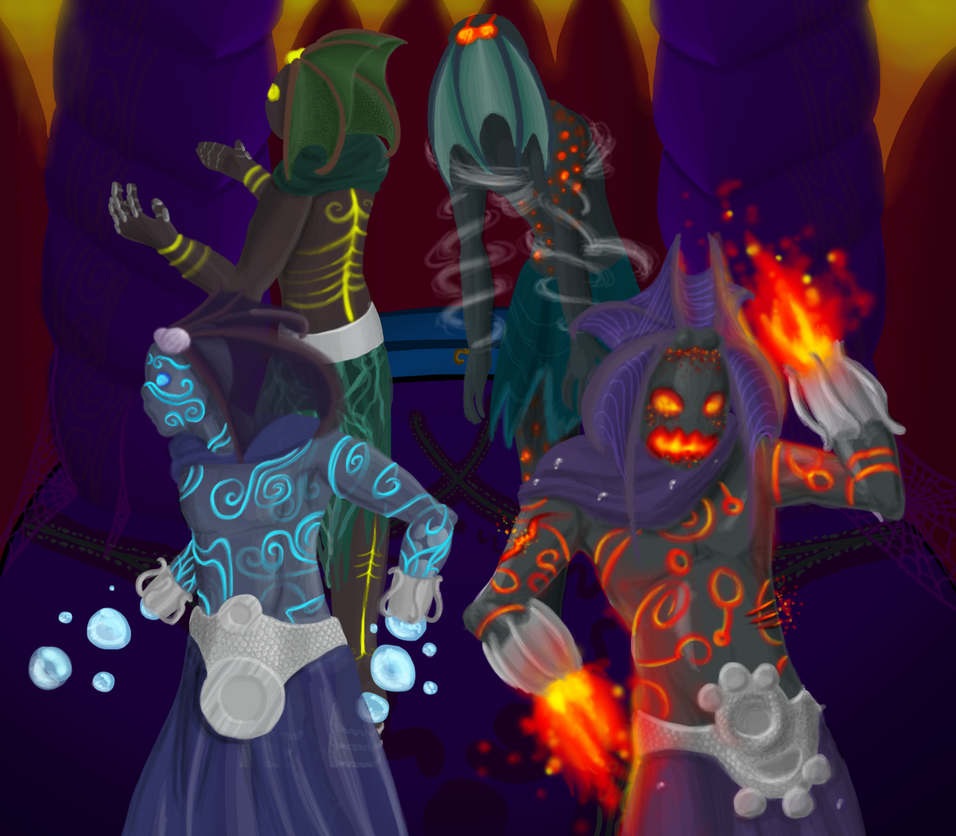
An image should take longer than a glance for the viewer to take in all the information, as such I included some interesting little effects to this piece, particularly in the water ascendant. The almost fully transparent head-fins are complimented by the semi-transparent skin, through which you can see the pattern swirling around the entire body. There are also bubbles inside the body which can be see in the foremost arm, which are being forced out to form the attack. The fire ascendant, as well as having blaze-effect patterns over his body, has suffered some wounds (on his waist and upper arm) which show his fiery blood angrily bubbling to the surface.
-Use complimentary and contrasting colours.
Unfortunatly, as this is a fan piece, most of the colour theory was done for me. The 2 characters on the right use strongly contrasting colours to highlight parts of their characters, the upper left (earth ascendant) uses complimentary colours (yellow and green through to brown) with contrast being drawn from the highlights and shades, while the water ascendant uses purely complimentary colours, only going from blue through to purple with greys. The background is largely based on the fire ascendant.
-Make the line-art crisp.
It's easy to lose details, and even body parts, to poorly drawn line-art. I've seen hands accidentally become hair and limbs drawn at the wrong depth, simply because the artist didn't display correctly what they meant by each line. When finishing off your line-art, get rid of EVERY line you don't need. If you won't be seeing it in the final piece, don't leave it in. You may well find the image changes a lot and you preferred it when it was busy with sketched lines, if this is the case then keep tweaking the final design till you're happy with it again. Using thicker lines to specify what is meant to be kept in the foreground is also an invaluable technique.
What I didn't do?
-Get a clear image of your mind of the composition early on.
I completely ignored this, in this case, this image started as a few headshots:
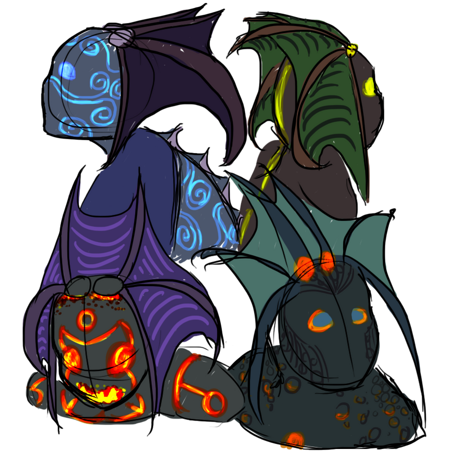
Which I enjoyed so much I wanted to see what I could create with full body shots. They were originally going to all be displayed seperately, though 3 characters in I decided to make it a group shot, as is the case in the boss encounter. (I should probably explain here, these characters are based on the Twilight Ascendant Council in the Bastion of Twilight, a raid in World of Warcraft: Cataclysm, all character designs copyright to Blizzard ofcourse).
-Keep in mind the main lightsource.
Again, as I did these pieces predominantly seperately, I didn't keep this in mind at all.
-Create a character that a 5 year old can replicate after seeing the character once.
This is something I heard and always strive to do in my character designs, as it ensures enough -pop- in what you're doing. Having a character so simple, for all the features to stand out so strongly, isn't always adopted in the games industry, though it's something I'd certainly like to see more of. Ofcourse, I couldn't attain that level in this piece as I'm not using my own characters.
(Note: A lot of the time, it's not what you want in the gaming industry. The characters in many Japanese games (Final Fantasy being a nice point here) have surprisingly intricate character designs which show a feat in clothes design, modelling prowess and imagination.)
That's all for now, but you may see more the of lower right (air ascendant) character, I've had a few ideas pertaining to him...
No comments:
Post a Comment