Sunday, 10 July 2011
A double ended chainsaw and other tools to avoid
Good evening! I've realized I should explain some of the brushes I use and why I use them. However, I instead decided to show you brushes I never go anywhere near! Okay, depending on the piece I will occasionally use smudge, but other than that...
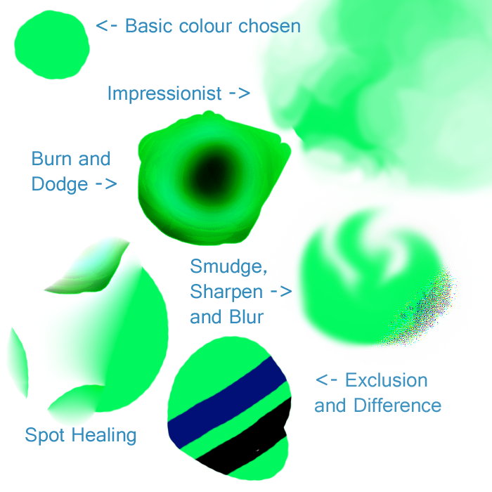
To begin with, I chose a nice off-green colour, the human eye naturally picks up green better than any other colour in the spectrum thanks to how much of our perceived gamut is taken up by green. (http://www.photo-lovers.org/img/gamut.png)
With this decided, to the brushes!
Impressionist can give an interesting watery look, however I find it far more interesting to see it in action than looking at the final result.. It works by taking the colour making up the majority of the brush radius at the time, filling the area of the brush with just that colour and blending the colours around it in with itself. Personally, I just can't find a style where this brush is suitable. It looks almost cartoonish, but I prefer a cleaner style for my cartoon pieces as blurring implies higher definition, making the eye look for details which just aren't there. To me, this brush creates a very dull "realistic" look that I can't wrap my head around.
Next we have burn and dodge. One lowers saturation, one increases shade (basically, one adds white, one adds black). It's an incredibly fast way to shade things, but...well, that's not how shading works. Light in itself usually has some sort of colour and it's this which should be used to light things. If you take any good picture of a lit human face from Google, use your eye dropper tool along where the shading begins to occur. Is it the skin colour, only darker? Usually not. You'll tend to find few dark peach colours and more blues and greens. Burn and dodge obviously don't take any of this into account, so I always stay well away.
Smudge, sharpen and Blur. Now, this is an awkward one, as I've recently taken to using smudge more... Sharpen and blur though! Sharpen, I've just never found a use for. Use it for even slightly too long and, instead of sharpening up edges and getting rid of blur, you get these horrible blocks of colour. Having tried sharpen a few times, I find other techniques much faster in tidying up blurred edges to this.
Blur...is fine if used sparingly. My main issue with blurring is that, if used over larger areas, it's very noticeable. You can usually tell when someone's been overdoing the blur, so I tend to try to avoid it all together if possible.
Spot Healing is a relatively new tool that I'm sure if great in photographs, but just..doesn't work very well for the kind of digital images I produce. You select an area with the brush, then let it do it's magic to get rid of the object you've selected and make it seem it was never there. Got an ugly bird in an otherwise beautiful sky? This is the tool for you. A misplaced toy on the floor of that photo of your daughter playing outside in the grass? Spot heal it away! Digital images? Yeeeeah...not so much. The issue here is the way it works is by sampling the area around the selected area and filling in the 'blank' with details and, if needed, blur anything left over in the area. Here we started with a green circle, and tried to remove the left of it. Instead of ending with half a circle, it sampled the area around 50 pixels to the right of where we selected and just copy-pasted it over the blurred out image of what we selected.... Not so great.
And the final part of this wall of text which I'm sure will get a few TL:DR's, exclusion and difference! Now, these arn't brushed in themselves, but types of the main brush. I just...don't see the point in them, what-so-ever. Exclusion is the slightly more interesting out of the 2, at least. Say you have an image you want to make black and white, but leave in the red? Go over the whole image a few times in pure green and pure blue brushes on exclusion and that's what you'll get. (Note: Here I was using a green brush over the green circle, hence leaving a black line). Difference left me with a blue line and...Well I just plain don't see the point in this one at all. Really, I'm not sure what you're meant to use it for or why anyone would use this. If someone knows, tell me? :)
Labels:
Guides,
Picture Included
Subscribe to:
Post Comments (Atom)

No comments:
Post a Comment